

How might we support luxury sales associates and increase their sales?
How might we support luxury sales associates and increase their sales?
How might we support luxury sales associates and increase their sales?
This was a 1 month project during 2023 where we designed a client management dashboard, tailoring the app to sales associates for The Row. Alpha is a growing enterprise startup, aiming to support sales teams of luxury fashion brands and increase their sales through customer management. The team for this project consisted of myself, a product manager, and our creative director. This case study focuses on redesigning the task management system for sales associates to view, create, and organize tasks related to one client.
This was a 1 month project during 2023 where we designed a client management dashboard, tailoring the app to sales associates for The Row. Alpha is a growing enterprise startup, aiming to support sales teams of luxury fashion brands and increase their sales through customer management.
The team for this project consisted of myself, a product manager, and our creative director. This case study focuses on redesigning the task management system for sales associates to view, create, and organize tasks related to one client.
UI
UI
UI
UX
UX
UX
Design Systems
Design Systems
Design Systems
Prototyping
Prototyping
Prototyping
Mobile Design
Mobile Design
Mobile Design
E-Commerce
E-Commerce
E-Commerce
Beauty
Beauty
Beauty
Clienteling
Clienteling
Clienteling
B2B
B2B
B2B
The problem
The problem
The problem
As a startup, Alpha’s product had gone through multiple design phases and didn’t have a concrete structure. The designs for the task management system were disjointed and rough; they lacked many use cases, flows, and general consistency. It was trying to break into a market that already had a pretty dominant competitor, so focusing on usability and appearance was just as important as addressing the key user and business needs.
As a startup, Alpha’s product had gone through multiple design phases and didn’t have a concrete structure. The designs for the task management system were disjointed and rough; they lacked many use cases, flows, and general consistency. It was trying to break into a market that already had a pretty dominant competitor, so focusing on usability and appearance was just as important as addressing the key user and business needs.
As a startup, Alpha’s product had gone through multiple design phases and didn’t have a concrete structure. The designs for the task management system were disjointed and rough; they lacked many use cases, flows, and general consistency. It was trying to break into a market that already had a pretty dominant competitor, so focusing on usability and appearance was just as important as addressing the key user and business needs.
Feature background
Feature background
Feature background
The Tasks page is where the Sales Associate can view and manage the appointments, to-do’s, and styling requests related to a specific customer. Most of the flows I worked on here were for editing items.
The Tasks page is where the Sales Associate can view and manage the appointments, to-do’s, and styling requests related to a specific customer. Most of the flows I worked on here were for editing items.
The Tasks page is where the Sales Associate can view and manage the appointments, to-do’s, and styling requests related to a specific customer. Most of the flows I worked on here were for editing items.
Initial exploration and research
Initial exploration and research
Initial exploration and research
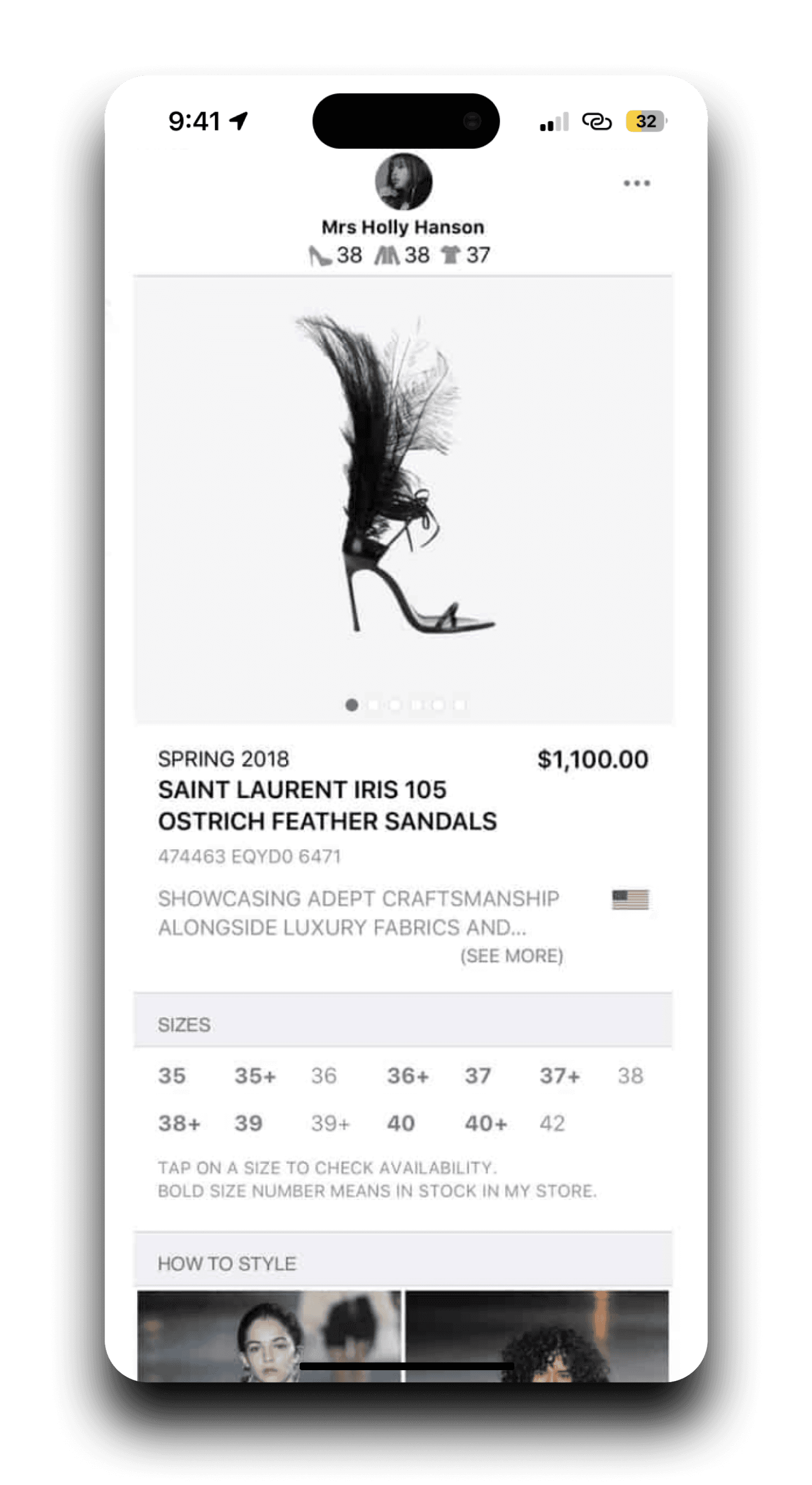


The Luce app felt so cold, and with a lack of typographical hierarchy and color coding, it felt easy to get lost in all the info!
The Luce app felt so cold, and with a lack of typographical hierarchy and color coding, it felt easy to get lost in all the info!
At Awake, we had worked on Alpha’s primary competitor, Luce Places, in the past. I looked through their features and designs, combing through the relevant or similar ones to what we needed to build. As an enterprise product, Luce Places
I made note of comparisons and ideas to use, while trying to better understand the business and user needs in a product like this.
We wanted to differentiate ourselves from this leading product; so I focused on increasing usability through color, typography, and hierarchy. Increasing usability would create a more efficient avenue for sales associates and lead to increased sales.
I worked closely with the product manager to prioritize features and discover the MVP. We started using the terms “Phase 1” and “Phase 2” to differentiate between features that needed to be designed immediately and features that were planned for a September 2023 release.
We decided that for this first phase, we wanted to create better hierarchy and usability within the existing design, build consistency, and embolden critical features like editing task items.
Objectives
Objectives
Objectives
We reviewed with The Row’s and with Alpha’s executive team to understand the user and business needs of the product. Of course the end goal was to increase revenue, but breaking that down into what would make that happen was important.
We reviewed with The Row’s and with Alpha’s executive team to understand the user and business needs of the product. Of course the end goal was to increase revenue, but breaking that down into what would make that happen was important.
We reviewed with The Row’s and with Alpha’s executive team to understand the user and business needs of the product. Of course the end goal was to increase revenue, but breaking that down into what would make that happen was important.
1
1
1
Increase product sales for the Sales Associates
Increase product sales for the Sales Associates
Increase product sales for the Sales Associates
I was designing for the Sales Associates, so I had to put their needs and goals first, which is to make money through commissions.
I was designing for the Sales Associates, so I had to put their needs and goals first, which is to make money through commissions.
I was designing for the Sales Associates, so I had to put their needs and goals first, which is to make money through commissions.
2
2
2
Create a beautiful, detailed, and efficient experience
Create a beautiful, detailed, and efficient experience
Create a beautiful, detailed, and efficient experience
The app is primarily targeted at luxury brands, and it was important to keep that image in mind.
The app is primarily targeted at luxury brands, and it was important to keep that image in mind.
The app is primarily targeted at luxury brands, and it was important to keep that image in mind.
3
3
3
Designs needed to be made quickly
Designs needed to be made quickly
Designs needed to be made quickly
As a startup, we needed to push toward a rapid launch and send designs to our developers as soon as possible.
As a startup, we needed to push toward a rapid launch and send designs to our developers as soon as possible.
As a startup, we needed to push toward a rapid launch and send designs to our developers as soon as possible.
Color palette
Color palette
Color palette
An important part of distinguishing Alpha from Luce Places was color; Luce’s lack of color hurt their users’ information absorption, and we wanted to increase usability. I used Alpha’s established style guide to see how I could incorporate the colors in a meaningful way.
An important part of distinguishing Alpha from Luce Places was color; Luce’s lack of color hurt their users’ information absorption, and we wanted to increase usability. I used Alpha’s established style guide to see how I could incorporate the colors in a meaningful way.
An important part of distinguishing Alpha from Luce Places was color; Luce’s lack of color hurt their users’ information absorption, and we wanted to increase usability. I used Alpha’s established style guide to see how I could incorporate the colors in a meaningful way.
Feedback
Feedback
Feedback
During the iterative design process, I presented the latest iterations to Alpha’s executive team of 2 co-founders, explaining my design decisions, thought processes, and final output. They gave us feedback on the designs, which we reviewed and applied before the next meeting.
During the iterative design process, I presented the latest iterations to Alpha’s executive team of 2 co-founders, explaining my design decisions, thought processes, and final output. They gave us feedback on the designs, which we reviewed and applied before the next meeting.
During the iterative design process, I presented the latest iterations to Alpha’s executive team of 2 co-founders, explaining my design decisions, thought processes, and final output. They gave us feedback on the designs, which we reviewed and applied before the next meeting.
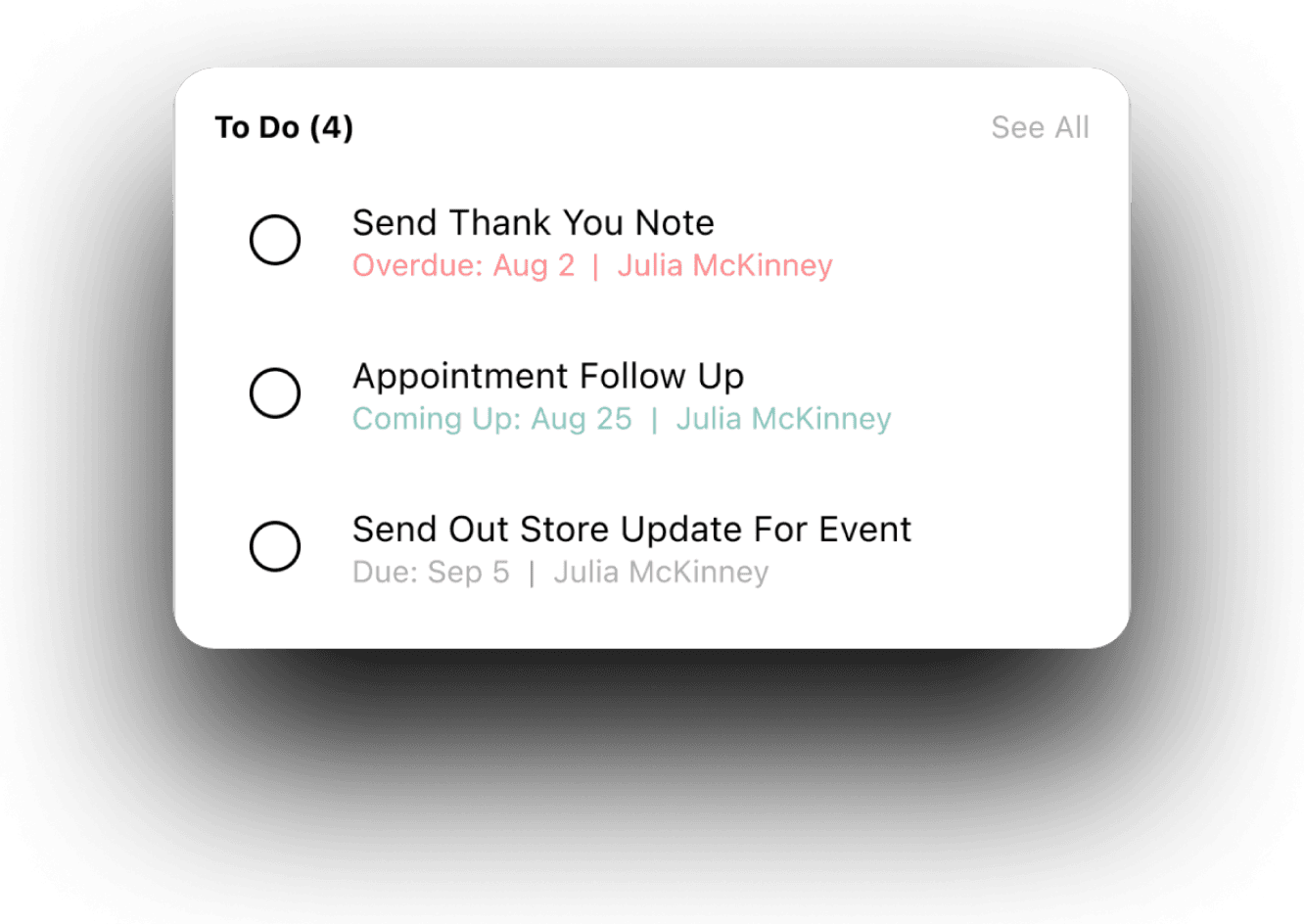


Even after color-coding the time sensitive subtitles for each to-do item, Alpha’s executive team brought up that this might not be enough to visually notify users and bring enough attention to more urgent actions. It’s crucial that a sales associate doesn’t miss a deadline- in the sales industry, being prompt determines a sale or not. I totally agreed, and tried to address this with more color items.
Even after color-coding the time sensitive subtitles for each to-do item, Alpha’s executive team brought up that this might not be enough to visually notify users and bring enough attention to more urgent actions. It’s crucial that a sales associate doesn’t miss a deadline- in the sales industry, being prompt determines a sale or not. I totally agreed, and tried to address this with more color items.
Even after color-coding the time sensitive subtitles for each to-do item, Alpha’s executive team brought up that this might not be enough to visually notify users and bring enough attention to more urgent actions. It’s crucial that a sales associate doesn’t miss a deadline- in the sales industry, being prompt determines a sale or not. I totally agreed, and tried to address this with more color items.
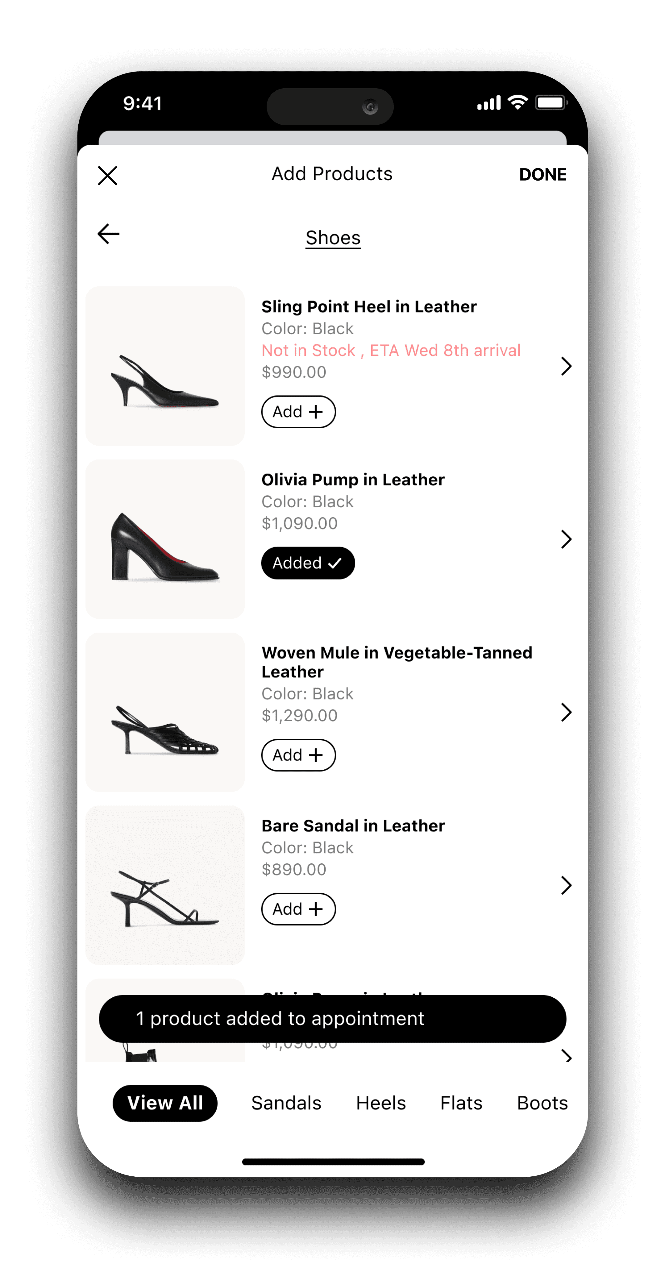


This was a hard decision! It felt like no matter which format we chose, there were usability issues.
This was a hard decision! It felt like no matter which format we chose, there were usability issues.
When adding products to an existing appointment, we needed to combine multiple functions:
When adding products to an existing appointment, we needed to combine multiple functions:
When adding products to an existing appointment, we needed to combine multiple functions:
1
Go back a page in the sequence while browsing the catalogue
Go back a page in the sequence while browsing the catalogue
Go back a page in the sequence while browsing the catalogue
2
Exit the catalogue and go back to the edit appointment screen
Exit the catalogue and go back to the edit appointment screen
Exit the catalogue and go back to the edit appointment screen
3
After you’re done adding items, go back to the edit appointment screen with the products you’ve added
After you’re done adding items, go back to the edit appointment screen with the products you’ve added
After you’re done adding items, go back to the edit appointment screen with the products you’ve added
The first version we tried received some concerns from our internal team at the agency and Alpha’s executive team. They mentioned how navigation might be confusing; does the X close out the entire edit feature or just the catalogue? And does tapping “done” refer to viewing the catalogue or the edit feature? It was cluttered, and avoiding confusion was important in this project, so we decided to minimize.
The first version we tried received some concerns from our internal team at the agency and Alpha’s executive team. They mentioned how navigation might be confusing; does the X close out the entire edit feature or just the catalogue? And does tapping “done” refer to viewing the catalogue or the edit feature? It was cluttered, and avoiding confusion was important in this project, so we decided to minimize.
The first version we tried received some concerns from our internal team at the agency and Alpha’s executive team. They mentioned how navigation might be confusing; does the X close out the entire edit feature or just the catalogue? And does tapping “done” refer to viewing the catalogue or the edit feature? It was cluttered, and avoiding confusion was important in this project, so we decided to minimize.
Final design
Final design
Final design
After several reviews with all of teams involved, we felt confident about our final design. As an MVP, we wanted to reach our goals of increasing usability so that sales associates could better navigate the app and therefore increase sales from a higher use rate. Although we couldn’t conduct A/B testing at this stage in the project because of time issues, our feedback from the executive team at Alpha and the design team at The Row demonstrated a successful solution for the meantime.
After several reviews with all of teams involved, we felt confident about our final design. As an MVP, we wanted to reach our goals of increasing usability so that sales associates could better navigate the app and therefore increase sales from a higher use rate. Although we couldn’t conduct A/B testing at this stage in the project because of time issues, our feedback from the executive team at Alpha and the design team at The Row demonstrated a successful solution for the meantime.
After several reviews with all of teams involved, we felt confident about our final design. As an MVP, we wanted to reach our goals of increasing usability so that sales associates could better navigate the app and therefore increase sales from a higher use rate. Although we couldn’t conduct A/B testing at this stage in the project because of time issues, our feedback from the executive team at Alpha and the design team at The Row demonstrated a successful solution for the meantime.
I designed badges for new or overdue items when applicable, notifying the user of items that required attention in a non-overwhelming way.
I designed badges for new or overdue items when applicable, notifying the user of items that required attention in a non-overwhelming way.
I designed badges for new or overdue items when applicable, notifying the user of items that required attention in a non-overwhelming way.

I slightly increased the saturation of the blue used in the color palette so that it would have higher contrast against the white.
I slightly increased the saturation of the blue used in the color palette so that it would have higher contrast against the white.
I slightly increased the saturation of the blue used in the color palette so that it would have higher contrast against the white.
I made 3 the max amount of items available in the preview lists. Having them all be visible wasn’t viable for edge cases where there might be a lot of style requests or upcoming appointments.
I made 3 the max amount of items available in the preview lists. Having them all be visible wasn’t viable for edge cases where there might be a lot of style requests or upcoming appointments.
I made 3 the max amount of items available in the preview lists. Having them all be visible wasn’t viable for edge cases where there might be a lot of style requests or upcoming appointments.

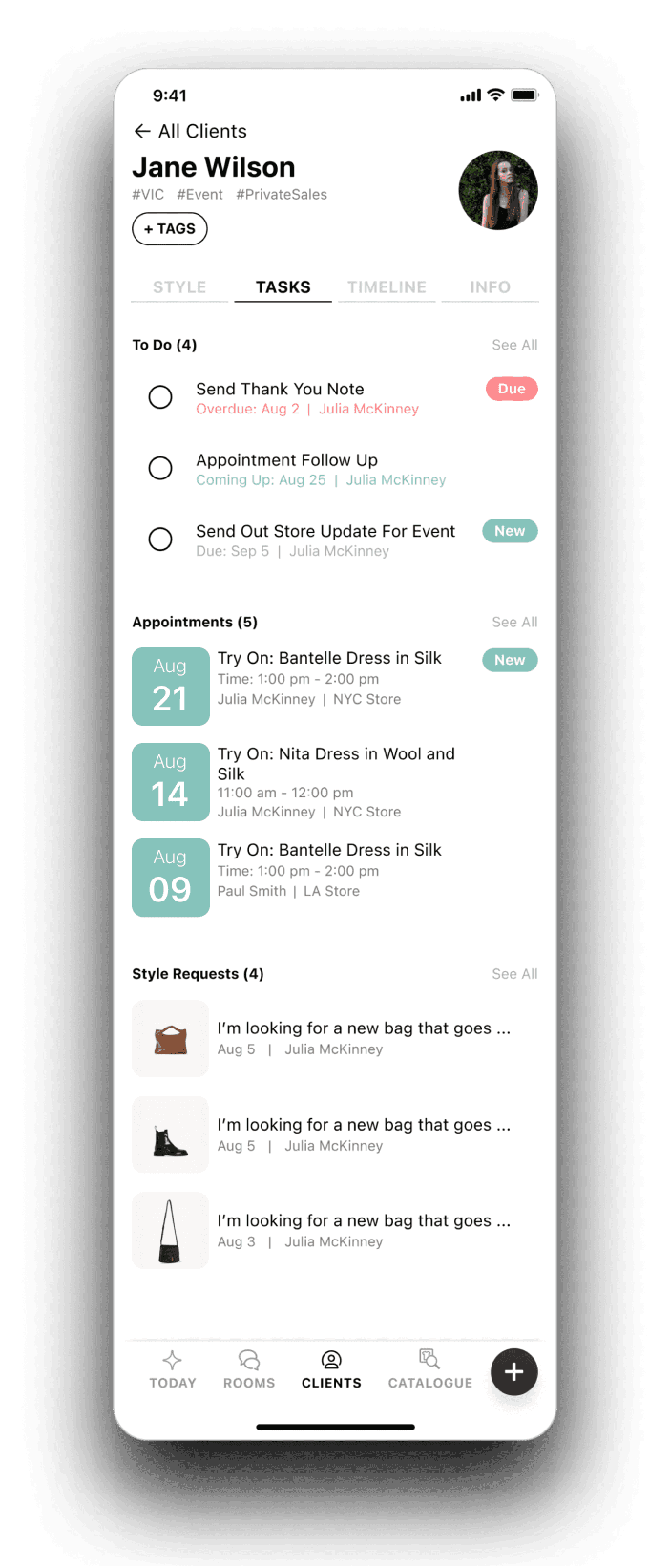


The Tasks main screen was really fun to design! It’s the home base for managing a client, and this is where visual organization was the most important.
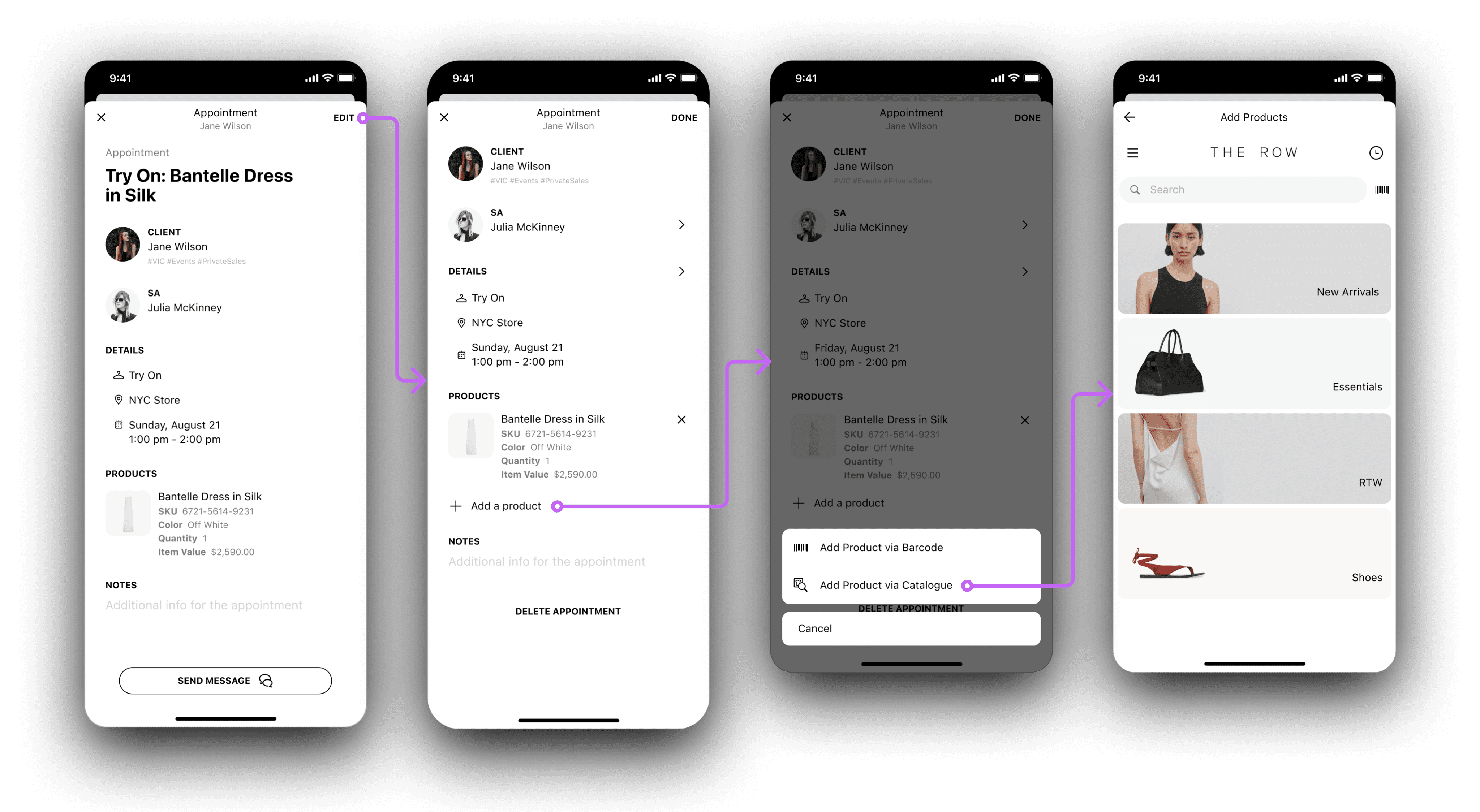


We already had a defined flow for scanning a barcode of an item, so our biggest focus in this project was developing an embedded catalog flow within editing. Because it was already a pop up, it was harder to differentiate the two separate flows. I decided that the best move here was to change the top navigation controls to visually represent that difference.
We already had a defined flow for scanning a barcode of an item, so our biggest focus in this project was developing an embedded catalog flow within editing. Because it was already a pop up, it was harder to differentiate the two separate flows. I decided that the best move here was to change the top navigation controls to visually represent that difference.
We already had a defined flow for scanning a barcode of an item, so our biggest focus in this project was developing an embedded catalog flow within editing. Because it was already a pop up, it was harder to differentiate the two separate flows. I decided that the best move here was to change the top navigation controls to visually represent that difference.


We landed on trying to make adding a product through the catalog as simple as possible. I reduced the button options to include only two: going back a step and finishing the add sequence.
The back arrow would take the user back one step at a time, and even though this decision limited options, we weren’t mixing two different flows anymore- the catalog and editing the appointment. I moved the Done button to a new hovering bar at the bottom- this removed the action from the header where it could be confusing, and I clearly labeled the number of items selected next to it.
Closing thoughts
Closing thoughts
Closing thoughts
We reached a great point in our MVP that focused on increasing usability to support our key user, while also satisfying business and stakeholder needs through communication and clear reviews.
We reached a great point in our MVP that focused on increasing usability to support our key user, while also satisfying business and stakeholder needs through communication and clear reviews.
We reached a great point in our MVP that focused on increasing usability to support our key user, while also satisfying business and stakeholder needs through communication and clear reviews.
I loved getting to design a project in the B2B, SaaS, beauty, and e-commerce space, and getting more experience in designing for startups. I’m excited to see where Alpha goes in the future!
I loved getting to design a project in the B2B, SaaS, beauty, and e-commerce space, and getting more experience in designing for startups. I’m excited to see where Alpha goes in the future!
I loved getting to design a project in the B2B, SaaS, beauty, and e-commerce space, and getting more experience in designing for startups. I’m excited to see where Alpha goes in the future!

