

How might we optimize the conversion funnel to increase revenue and decrease X-out rates?
How might we optimize the conversion funnel to increase revenue and decrease X-out rates?
How might we optimize the conversion funnel to increase revenue and decrease X-out rates?
During my contract at Meta, I was a product designer on the Facebook Monetization team, working as the primary designer for two projects while creating and bettering ad experiences in previously non-monetized spaces. I collaborated with product designers, content designers, engineers, product managers, UX researchers, and product leaders across multiple teams to bring this project to life.
During my contract at Meta, I was a product designer on the Facebook Monetization team, working as the primary designer for two projects while creating and bettering ad experiences in previously non-monetized spaces. I collaborated with product designers, content designers, engineers, product managers, UX researchers, and product leaders across multiple teams to bring this project to life.
During my contract at Meta, I was a product designer on the Facebook Monetization team, working as the primary designer for two projects while creating and bettering ad experiences in previously non-monetized spaces. I collaborated with product designers, content designers, engineers, product managers, UX researchers, and product leaders across multiple teams to bring this project to life.
UI
UI
UI
UX
UX
UX
Design Systems
Design Systems
Design Systems
Prototyping
Prototyping
Prototyping
Ad Experiences
Ad Experiences
Ad Experiences
Design Thinking
Design Thinking
Design Thinking
Social Media
Social Media
Social Media
Mobile Design
Mobile Design
Mobile Design
Disclaimer
Disclaimer
Disclaimer
Unfortunately, due to company policy and privacy reasons, I can’t show many details about this project. This means I’m not allowed to include screens or detailed descriptions, so please forgive me for being vague. However, as such an impactful project for me, I really wanted to talk about it.
Unfortunately, due to company policy and privacy reasons, I can’t show many details about this project. This means I’m not allowed to include screens or detailed descriptions, so please forgive me for being vague. However, as such an impactful project for me, I really wanted to talk about it.
Unfortunately, due to company policy and privacy reasons, I can’t show many details about this project. This means I’m not allowed to include screens or detailed descriptions, so please forgive me for being vague. However, as such an impactful project for me, I really wanted to talk about it.
The problem
The problem
The problem
Feature background
Feature background
Feature background
Earlier that year, the team had created a new ad component that was being placed in a previously non-monetized space. It was reusing a common component within the Facebook app, using it within its native space but repurposing it to be a new ad item. It would provide a new avenue in which advertisers can reach users, particularly in a way that can have repeated ad impressions.
When the user clicked the ad component, it would take the user to a “permalink” page- a median between the ad component and the end destination (eg. the advertiser’s website). It had the full advertiser text content and social context (likes, comments, etc.), and then from that median page, the user would then click a button that took them to the end destination.


Pros
Gives the user more info and social context
Gives the user more info and social context
Cons
Low conversion rates, high drop out rates
Low conversion rates, high drop out rates
The dilemma
The dilemma
The dilemma
In the early A/B tests for the new ad component, the conversion rates were lower than expected or desired, sitting at about 3%. Team leaders wanted to improve this, so we needed to find a way to optimize how users perceived and interacted with the ad component so that they would be more likely to follow through, convert, and create revenue.
In the early A/B tests for the new ad component, the conversion rates were lower than expected or desired, sitting at about 3%. Team leaders wanted to improve this, so we needed to find a way to optimize how users perceived and interacted with the ad component so that they would be more likely to follow through, convert, and create revenue.
In the early A/B tests for the new ad component, the conversion rates were lower than expected or desired, sitting at about 3%. Team leaders wanted to improve this, so we needed to find a way to optimize how users perceived and interacted with the ad component so that they would be more likely to follow through, convert, and create revenue.
Initial exploration and research
Initial exploration and research
Initial exploration and research
Ad types
Ad types
Ad types
For a bit more context, there are 5 primary categories of ads, leading to various end destinations. We wanted to define these and their end destinations so we could better optimize the conversion funnel, and it gave us a great foundation moving forward.
For a bit more context, there are 5 primary categories of ads, leading to various end destinations. We wanted to define these and their end destinations so we could better optimize the conversion funnel, and it gave us a great foundation moving forward.
For a bit more context, there are 5 primary categories of ads, leading to various end destinations. We wanted to define these and their end destinations so we could better optimize the conversion funnel, and it gave us a great foundation moving forward.
Single and multiple image ads
Single and multiple image ads
Leads to off-site destination
Post-click
In-app browser
Video Ads
Video Ads
Video-focused ads, leading to a Facebook feature for watching and viewing the site
Post-click
In-app video & browsing feature
Onsite conversion
Onsite conversion
Ads to lead to conversion within FB. Usually messaging with a business or page.
Post-click
Messenger
Input forms
Input forms
Ads that lead to input forms for surveys, contact info, newsletters, etc.
Post-click
Input form
Single image, multiple image, and video ads make up 76% of ads on the Facebook app combined, so we knew that media content was important to consider in our ideation.
Single image, multiple image, and video ads make up 76% of ads on the Facebook app combined, so we knew that media content was important to consider in our ideation.
Single image, multiple image, and video ads make up 76% of ads on the Facebook app combined, so we knew that media content was important to consider in our ideation.
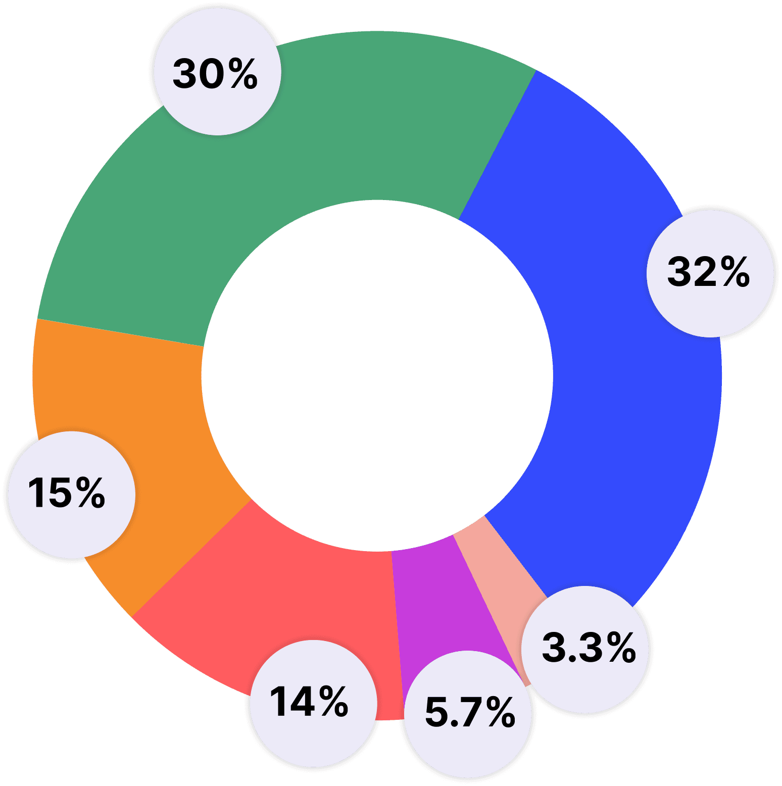


Single image ads
32%
Video ads
30%
On site conversion ads
15%
Multiple image ads
14%
Input form ads
3.3%
Other
5.7%
Media thumbnails
Media thumbnails
Media thumbnails
Since a big objective in this project was to entice users to convert, we needed to give users clear expectations. We invested a lot of time into including image thumbnails in the ad component, so we could provide the user with context and make them feel more comfortable with clicking it.
I worked closely with a product designer on a parallel team to align the original component with the ad version of the component, so we could bring it to leadership with clear guidelines.



We used the product or content image provided by the advertiser, which meant that the relevancy of the image to the ad could fluctuate in quality.
There was a few reasons why this didn’t work out. Because the ad component was already small to begin with, the thumbnails were small and potentially hard to see for those with accessibility needs.
There was a few reasons why this didn’t work out. Because the ad component was already small to begin with, the thumbnails were small and potentially hard to see for those with accessibility needs.
There was a few reasons why this didn’t work out. Because the ad component was already small to begin with, the thumbnails were small and potentially hard to see for those with accessibility needs.
The design system team and our design leaders were very reluctant to approve it, since it changed the original component enough that it broke the design system guidelines. We ended up scrapping these designs, but it was an influential part of our efforts to promote context.
The design system team and our design leaders were very reluctant to approve it, since it changed the original component enough that it broke the design system guidelines. We ended up scrapping these designs, but it was an influential part of our efforts to promote context.
The design system team and our design leaders were very reluctant to approve it, since it changed the original component enough that it broke the design system guidelines. We ended up scrapping these designs, but it was an influential part of our efforts to promote context.
Design extremities
Design extremities
Design extremities
As a team we wanted to get really crazy with ideation, which led to some wild ideas, which our team had conflicting thoughts on.
As a team we wanted to get really crazy with ideation, which led to some wild ideas, which our team had conflicting thoughts on.
As a team we wanted to get really crazy with ideation, which led to some wild ideas, which our team had conflicting thoughts on.
What I noticed the most was the difference between the PM/engineer perspective versus the designer perspective. They wanted to completely alter the original component in a way that would really stand out and call user attention, thinking this would increase conversion rates and boost revenue.
What I noticed the most was the difference between the PM/engineer perspective versus the designer perspective. They wanted to completely alter the original component in a way that would really stand out and call user attention, thinking this would increase conversion rates and boost revenue.
What I noticed the most was the difference between the PM/engineer perspective versus the designer perspective. They wanted to completely alter the original component in a way that would really stand out and call user attention, thinking this would increase conversion rates and boost revenue.
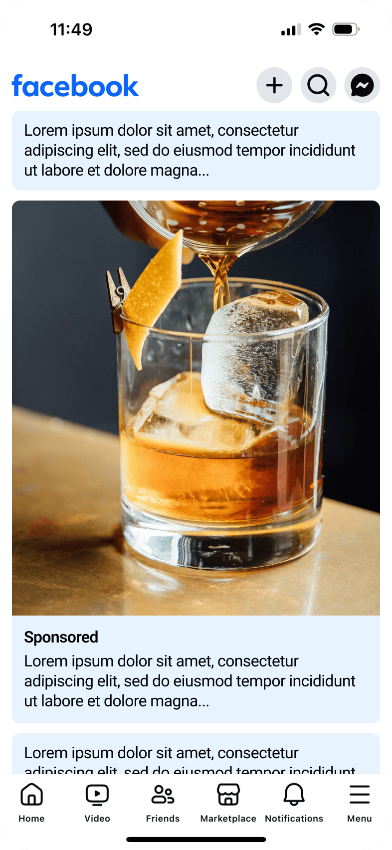

Just to give an idea of proportions, this is a simplified and altered example of the ad structure they were proposing, within the surrounding context.
Just to give an idea of proportions, this is a simplified and altered example of the ad structure they were proposing, within the surrounding context.
They suggested a design (roughly pictured here) that made the media image as large as what you’d find on the home feed, filling up the whole screen.
They suggested a design (roughly pictured here) that made the media image as large as what you’d find on the home feed, filling up the whole screen.
They suggested a design (roughly pictured here) that made the media image as large as what you’d find on the home feed, filling up the whole screen.
But I argued that it was visually aggressive, especially in comparison to the non-sponsored version of the component, and ultimately would sour user sentiment. It communicated to users that we cared more about revenue than their social connections.
But I argued that it was visually aggressive, especially in comparison to the non-sponsored version of the component, and ultimately would sour user sentiment. It communicated to users that we cared more about revenue than their social connections.
But I argued that it was visually aggressive, especially in comparison to the non-sponsored version of the component, and ultimately would sour user sentiment. It communicated to users that we cared more about revenue than their social connections.
We discussed these points back and forth in meetings, with me making strong points for the users, and we as a team came to the conclusion to not move forward with testing these designs.
We discussed these points back and forth in meetings, with me making strong points for the users, and we as a team came to the conclusion to not move forward with testing these designs.
We discussed these points back and forth in meetings, with me making strong points for the users, and we as a team came to the conclusion to not move forward with testing these designs.
Final design
Final design
Final design
Conversion funnel
Conversion funnel
Conversion funnel
As a straightforward solution, our team decided to remove the median permalink page, shortening the conversion funnel and minimizing friction throughout the flow. For example, when a user clicked a single image ad, it would directly open the in-app browser.
By removing one of the chances for the user to drop out and simplifying the user flow, we thought this would help push users to convert and therefore generate revenue.
I fleshed out any remaining user flows and parameters and worked with the engineers to get it launched for the next test cycle.
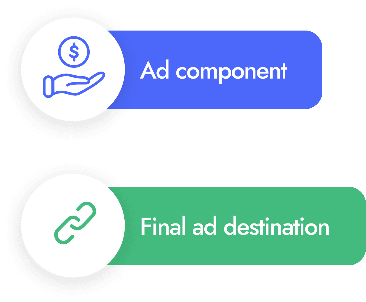


Although excited about how this could increase conversion rates, I had a few concerns, mainly that it removed context (the full advertiser text and likes/comments/etc.) and that some users might see it as aggressive. I wondered how much of an impact the context had on a user’s decision to click on the ad, so I felt very interested to see how testing would go.
Although excited about how this could increase conversion rates, I had a few concerns, mainly that it removed context (the full advertiser text and likes/comments/etc.) and that some users might see it as aggressive. I wondered how much of an impact the context had on a user’s decision to click on the ad, so I felt very interested to see how testing would go.
Although excited about how this could increase conversion rates, I had a few concerns, mainly that it removed context (the full advertiser text and likes/comments/etc.) and that some users might see it as aggressive. I wondered how much of an impact the context had on a user’s decision to click on the ad, so I felt very interested to see how testing would go.
Pros
Pros
Pros
Reduces the number of clicks and removes a chance to drop out
Cons
Cons
Cons
Could be perceived as abrupt or aggressive
Could be perceived as abrupt or aggressive
Could be perceived as abrupt or aggressive
Communicating destinations
Communicating destinations
Communicating destinations



These aren’t the exact icons, but this gives a general idea of what we were using.
A key component of this was making sure users had context for what to expect. We decided to reuse existing icons used prominently throughout the app to visually communicate that different ads led to different destinations.
A key component of this was making sure users had context for what to expect. We decided to reuse existing icons used prominently throughout the app to visually communicate that different ads led to different destinations.
A key component of this was making sure users had context for what to expect. We decided to reuse existing icons used prominently throughout the app to visually communicate that different ads led to different destinations.
I worked with my team’s content designer and a parallel team’s product designer to assign a glyph to each ad type, and I brought our decisions to the design system team. We made a few small adjustments with their input, and included the glyph assignments in the next update.
I worked with my team’s content designer and a parallel team’s product designer to assign a glyph to each ad type, and I brought our decisions to the design system team. We made a few small adjustments with their input, and included the glyph assignments in the next update.
I worked with my team’s content designer and a parallel team’s product designer to assign a glyph to each ad type, and I brought our decisions to the design system team. We made a few small adjustments with their input, and included the glyph assignments in the next update.
Results
Results
Results
A/B testing
A/B testing
A/B testing
We got A/B testing results from weekly test cycle updates, which the engineering team kept me updated on. It helped us iterate as needed, and it gave some interesting statistics for the new designs.
We got A/B testing results from weekly test cycle updates, which the engineering team kept me updated on. It helped us iterate as needed, and it gave some interesting statistics for the new designs.
We got A/B testing results from weekly test cycle updates, which the engineering team kept me updated on. It helped us iterate as needed, and it gave some interesting statistics for the new designs.
1
X-out rate got cut in half
The users who exited the final destination within 3 seconds was half the amount of users who left the permalink median page before clicking the ad again to go to the final destination.
2
Conversion rate had a 64% improvement
Compared to the control data, the conversion rate improved by 64%, showing that reducing the drop off points was actually effective.
User interviews
User interviews
User interviews
Annie, our UX researcher on the team, conducted the user interviews herself, but worked closely with me to prepare talking points and I created prototypes for the tests. She conducted 30 minute, 1-on-1 concept testing sessions with 9 participants. I sat in on all the interviews and interestingly, feedback was pretty split.
Annie, our UX researcher on the team, conducted the user interviews herself, but worked closely with me to prepare talking points and I created prototypes for the tests. She conducted 30 minute, 1-on-1 concept testing sessions with 9 participants. I sat in on all the interviews and interestingly, feedback was pretty split.
Annie, our UX researcher on the team, conducted the user interviews herself, but worked closely with me to prepare talking points and I created prototypes for the tests. She conducted 30 minute, 1-on-1 concept testing sessions with 9 participants. I sat in on all the interviews and interestingly, feedback was pretty split.
8 out of 9
8 out of 9
Participants were initially uncomfortable with this section being monetized, until they were told the ads would be high intent towards their activity.
Participants were initially uncomfortable with this section being monetized, until they were told the ads would be high intent towards their activity.
The ads being relevant to the users was a huge selling point for them, so we had to make sure this was clear to our product managers and engineers.
5 out of 9
5 out of 9
Participants preferred the direct destinations
Participants preferred the direct destinations
They mentioned that they liked how simple it was, and that positive reaction could help how the user reacts to the product or service being pushed on them.
4 out of 9
4 out of 9
Participants preferred to stay within the Facebook app
Participants preferred to stay within the Facebook app
This is specifically in reference to ad components that would immediately open the in-app browser, which to them felt aggressive.
I found this interesting because I was concerned with how this flow might be perceived as abrupt or aggressive, so this seemed to validate those expectations. But based on the A/B tests, it appeared to be more effective in conversion rates and drop out rates. My takeaway overall from this was that more user interviews were needed, especially as development continued.
But generally, our team and leadership was satisfied with the results, and wanted to continue developing this feature as we got more advertiser content.
Closing thoughts
Closing thoughts
Closing thoughts
In my previous projects, user needs were always the focus, and it’s become a passion of mine. But this project had business needs and revenue at the forefront, much more so than I had ever had to focus on before, and it challenged me to find a great balance.
In my previous projects, user needs were always the focus, and it’s become a passion of mine. But this project had business needs and revenue at the forefront, much more so than I had ever had to focus on before, and it challenged me to find a great balance.
In my previous projects, user needs were always the focus, and it’s become a passion of mine. But this project had business needs and revenue at the forefront, much more so than I had ever had to focus on before, and it challenged me to find a great balance.
Although at times difficult, my product managers, engineers, and I always found reasonable and ethical solutions. I collaborated with so many people to make this a successful project, finding a way to respect users while improving revenue streams.
Although at times difficult, my product managers, engineers, and I always found reasonable and ethical solutions. I collaborated with so many people to make this a successful project, finding a way to respect users while improving revenue streams.
Although at times difficult, my product managers, engineers, and I always found reasonable and ethical solutions. I collaborated with so many people to make this a successful project, finding a way to respect users while improving revenue streams.
Up next
Up next
Up next


