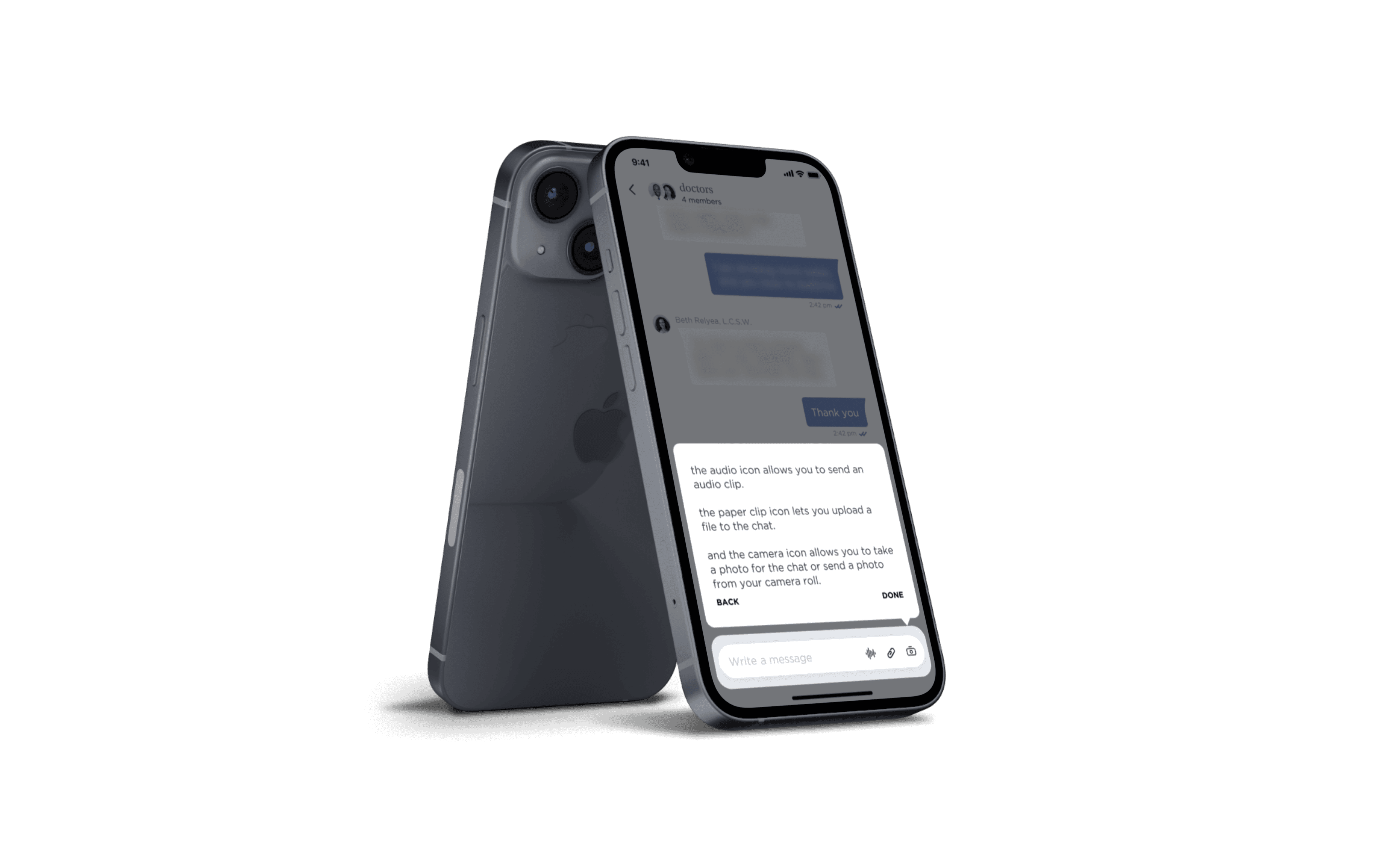


How might we aid less technologically-savvy users during onboarding while respecting the needs of other users?
During this 2 month project for a comprehensive healthcare and wellness startup, we designed a tutorial system for approx. 50% of the user base: non-technologically-savvy users. We wanted to decrease the number of customer support requests to create a more smooth and seamless experience. Although I primarily led this end-to-end project, I also worked with Awake’s project manager, creative director, and other product designer, and with Well Works’ VP of Product and their Head of Engineering.
UI
UX
Design Systems
Prototyping
Mobile Design
UI Animation
Product Strategy
Healthcare
B2B2C
How might we aid less technologically-savvy users during onboarding while respecting the needs of other users?
This was a 1 month project during 2023 where we designed a client management dashboard, tailoring the app to sales associates for The Row. Alpha is a growing enterprise startup, aiming to support sales teams of luxury fashion brands and increase their sales through customer management.
The team for this project consisted of myself, a product manager, and our creative director. This case study focuses on redesigning the task management system for sales associates to view, create, and organize tasks related to one client.
UI
UX
Design Systems
Prototyping
Mobile Design
UI Animation
Product Strategy
Healthcare
B2B2C
The problem
The problem
The problem
Through Well Works' data of their first users and projected market groups, we knew that we had one significant user group that needed addressing in the experience: elderly, non-tech-savvy, or rural populations, who would need extra guidance using the app. These users would be approximately half of our user base, and made up about 75% of our current beta users. These users at the time were reaching out to customer support for guidance about 40% of time, so our goal here was to reduce the number of customer support requests for this user group.
We also knew that the other half of our users would be young to middle-aged adults- generally tech-savvy, intuitive, and learning by self-exploration, so we had to find a way to accommodate both groups. I spearheaded this end-to-end project from ideation to shipping.
Important note
Important note
Important note
This project is under an NDA and I’m not permitted to publish images online. I’ve changed the name of the company, omitted some details, and altered some images to protect the identity of the client and the product’s confidentiality. More project details can be shared in a smaller presentation setting.
This project is under an NDA and I’m not permitted to publish images online. I’ve changed the name of the company, omitted some details, and altered some images to protect the identity of the client and the product’s confidentiality. More project details can be shared in a smaller presentation setting.
This project is under an NDA and I’m not permitted to publish images online. I’ve changed the name of the company, omitted some details, and altered some images to protect the identity of the client and the product’s confidentiality. More project details can be shared in a smaller presentation setting.
Initial exploration and research
Initial exploration and research
Initial exploration and research
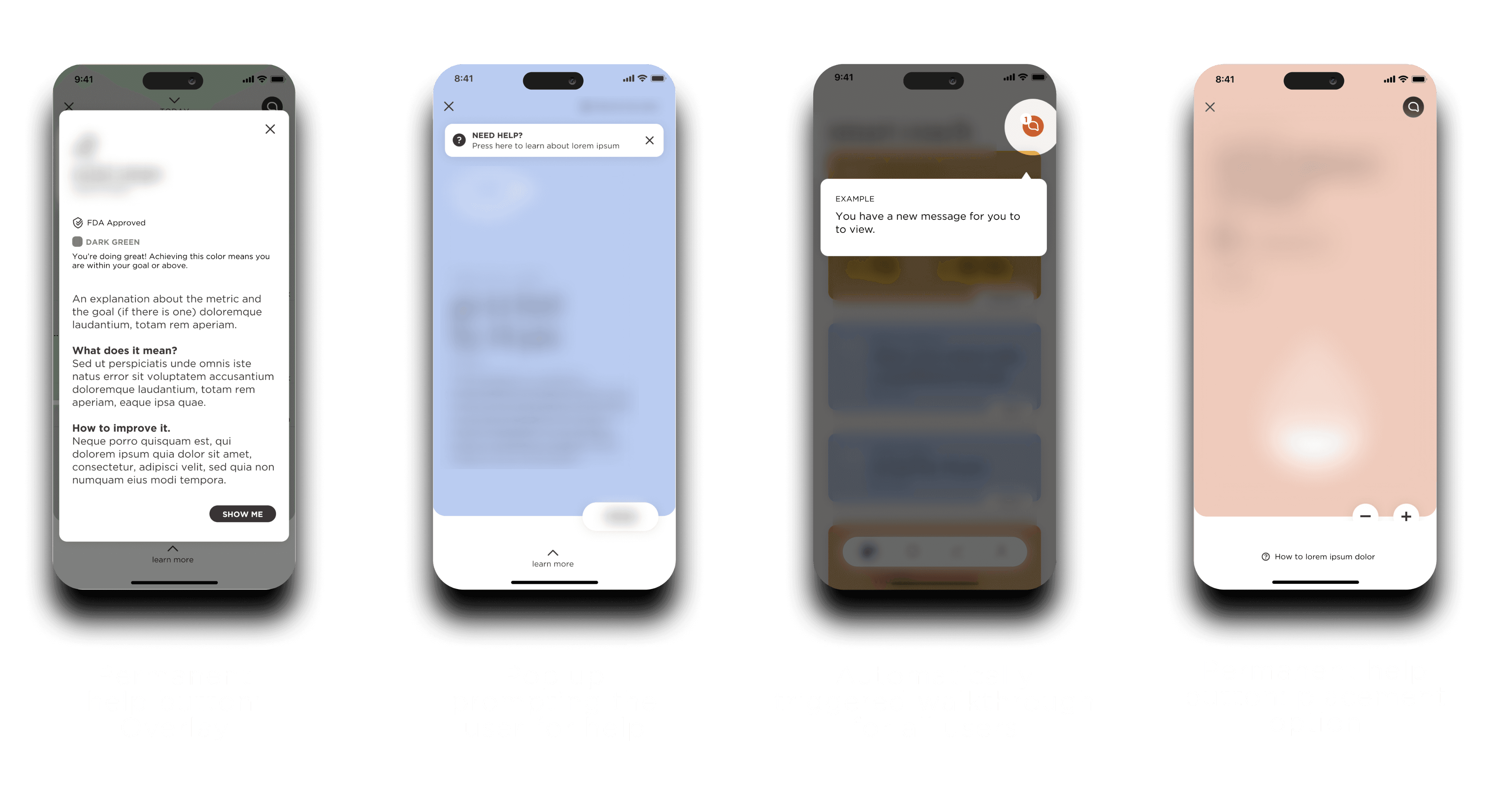


None of these ideas fit all of our user needs-- and some had some pretty problematic UX issues!
In the past, our team had played with some ideas for this problem in earlier stages of our work with them. They didn’t address our key issues; either they forced a tutorial on everyone, they were too invasive, or they weren’t easy to access and understand. With a new release date approaching quickly, we had to evaluate our objectives and find a solution that would actually help all of our users.
In the past, our team had played with some ideas for this problem in earlier stages of our work with them. They didn’t address our key issues; either they forced a tutorial on everyone, they were too invasive, or they weren’t easy to access and understand. With a new release date approaching quickly, we had to evaluate our objectives and find a solution that would actually help all of our users.
In the past, our team had played with some ideas for this problem in earlier stages of our work with them. They didn’t address our key issues; either they forced a tutorial on everyone, they were too invasive, or they weren’t easy to access and understand. With a new release date approaching quickly, we had to evaluate our objectives and find a solution that would actually help all of our users.
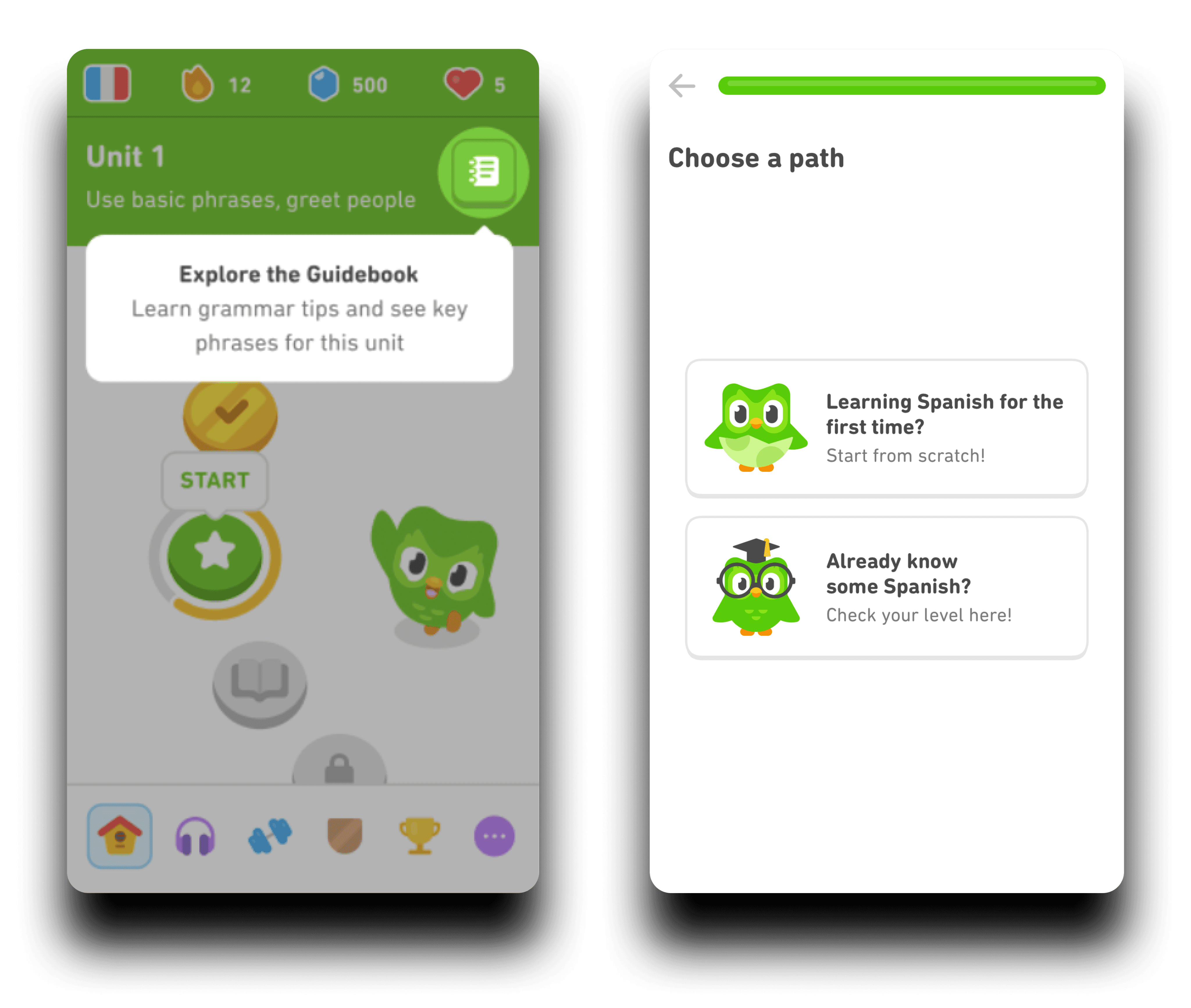


Awake’s other product designer and I started examining other apps’ onboarding and tutorial training features.
Duolingo was a great example for us; their highlighted overlays were a simple and soft way to introduce the app and its features. And the concept of choosing a path to figure out the level of understanding made for a more personalized experience.
Objectives
Objectives
Objectives
1
1
1
Balance the needs of both user groups
Balance the needs of both user groups
Balance the needs of both user groups
We didn’t want to annoy users who could easily figure things out on their own. It’s always annoying when using a new app and just immediately skipping through all the tutorial messages when you don’t need it. But obviously, we had a huge issue with our struggling user group.
We didn’t want to annoy users who could easily figure things out on their own. It’s always annoying when using a new app and just immediately skipping through all the tutorial messages when you don’t need it. But obviously, we had a huge issue with our struggling user group.
We didn’t want to annoy users who could easily figure things out on their own. It’s always annoying when using a new app and just immediately skipping through all the tutorial messages when you don’t need it. But obviously, we had a huge issue with our struggling user group.
2
2
2
Create flexibility for users who are not sure which group they fall into
Create flexibility for users who are not sure which group they fall into
Create flexibility for users who are not sure which group they fall into
Of course, we couldn’t ignore those edge users in the middle-- those not sure if they need help or not, or at least wanting a little bit of help.
Of course, we couldn’t ignore those edge users in the middle-- those not sure if they need help or not, or at least wanting a little bit of help.
Of course, we couldn’t ignore those edge users in the middle-- those not sure if they need help or not, or at least wanting a little bit of help.
3
3
3
Prioritize accessibility and inclusivity for the users facing more challenges
Prioritize accessibility and inclusivity for the users facing more challenges
Prioritize accessibility and inclusivity for the users facing more challenges
Simplicity was key in making the tutorial easy for users to process. This meant clear and simple explanations and natural progression of content.
Simplicity was key in making the tutorial easy for users to process. This meant clear and simple explanations and natural progression of content.
Simplicity was key in making the tutorial easy for users to process. This meant clear and simple explanations and natural progression of content.
Feedback
Feedback
Feedback
I led several meetings with Well Works’ team throughout this process to receive their feedback. After brainstorming with our other product designer, I organized our final concept into a clear presentation for Well Works’ team. As I developed sketches and early designs, I kept them in the loop during our regular meetings.
I led several meetings with Well Works’ team throughout this process to receive their feedback. After brainstorming with our other product designer, I organized our final concept into a clear presentation for Well Works’ team. As I developed sketches and early designs, I kept them in the loop during our regular meetings.
I led several meetings with Well Works’ team throughout this process to receive their feedback. After brainstorming with our other product designer, I organized our final concept into a clear presentation for Well Works’ team. As I developed sketches and early designs, I kept them in the loop during our regular meetings.
Well Works’ feedback
Well Works’ feedback
Well Works’ feedback
1
They liked the concept of choosing a path, but they wanted it to be even more clear for users to switch between them
They liked the concept of choosing a path, but they wanted it to be even more clear for users to switch between them
They liked the concept of choosing a path, but they wanted it to be even more clear for users to switch between them
At the time, we had the option to switch between modes in the settings/profile section. Well Works’ VP of product wanted it be more obvious or made known, because he always thought that every user should have the tutorial, despite the user data showing otherwise.
At the time, we had the option to switch between modes in the settings/profile section. Well Works’ VP of product wanted it be more obvious or made known, because he always thought that every user should have the tutorial, despite the user data showing otherwise.
At the time, we had the option to switch between modes in the settings/profile section. Well Works’ VP of product wanted it be more obvious or made known, because he always thought that every user should have the tutorial, despite the user data showing otherwise.
2
When selecting a path, they wanted to still give everyone a general overview of the app’s different pages before the user decided how much help they needed.
When selecting a path, they wanted to still give everyone a general overview of the app’s different pages before the user decided how much help they needed.
When selecting a path, they wanted to still give everyone a general overview of the app’s different pages before the user decided how much help they needed.
We first designed a one page question for the user during the onboarding and app setup, just explaining what the different modes were. But once they suggested this point, that everyone deserved to get a starting picture of everything, I thought that giving more context for these options was important.
We first designed a one page question for the user during the onboarding and app setup, just explaining what the different modes were. But once they suggested this point, that everyone deserved to get a starting picture of everything, I thought that giving more context for these options was important.
We first designed a one page question for the user during the onboarding and app setup, just explaining what the different modes were. But once they suggested this point, that everyone deserved to get a starting picture of everything, I thought that giving more context for these options was important.
We asked users:
We asked users:
We asked users:
Which section of the app do you find is the most confusing?
Which section of the app do you find is the most confusing?
Which section of the app do you find is the most confusing?
Well Works and I sent a survey to 20 of the beta users who fell into the non-technologically-savvy user group, and we wanted to tweak and weigh the tutorial sequences towards the most needed sections. We discovered that data-heavy sections, like the pages displaying stat-tracking and biometric information, were the most confusing for them. This what pretty much what I expected, because it required the most analysis from the user.
Well Works and I sent a survey to 20 of the beta users who fell into the non-technologically-savvy user group, and we wanted to tweak and weigh the tutorial sequences towards the most needed sections. We discovered that data-heavy sections, like the pages displaying stat-tracking and biometric information, were the most confusing for them. This what pretty much what I expected, because it required the most analysis from the user.
Well Works and I sent a survey to 20 of the beta users who fell into the non-technologically-savvy user group, and we wanted to tweak and weigh the tutorial sequences towards the most needed sections. We discovered that data-heavy sections, like the pages displaying stat-tracking and biometric information, were the most confusing for them. This what pretty much what I expected, because it required the most analysis from the user.


There was a clear choice that came out of this, and other sections would have to be more deeply evaluated at a later time for this quick launch.
Final design
Final design
Final design
In the end, we shipped designs that reflected the stakeholder and user feedback, so we felt pretty confident about it. We ended the onboarding sequence by quickly introducing general concepts of the app. I also made it clear to the user what “help mode” was, and gave an unmistakeable option to turn it on or not. We also made sure to clarify to the user that they could turn Help Mode on and off when needed through settings through an overlay on the main home screen after finishing onboarding.
In the end, we shipped designs that reflected the stakeholder and user feedback, so we felt pretty confident about it. We ended the onboarding sequence by quickly introducing general concepts of the app. I also made it clear to the user what “help mode” was, and gave an unmistakeable option to turn it on or not. We also made sure to clarify to the user that they could turn Help Mode on and off when needed through settings through an overlay on the main home screen after finishing onboarding.
In the end, we shipped designs that reflected the stakeholder and user feedback, so we felt pretty confident about it. We ended the onboarding sequence by quickly introducing general concepts of the app. I also made it clear to the user what “help mode” was, and gave an unmistakeable option to turn it on or not. We also made sure to clarify to the user that they could turn Help Mode on and off when needed through settings through an overlay on the main home screen after finishing onboarding.
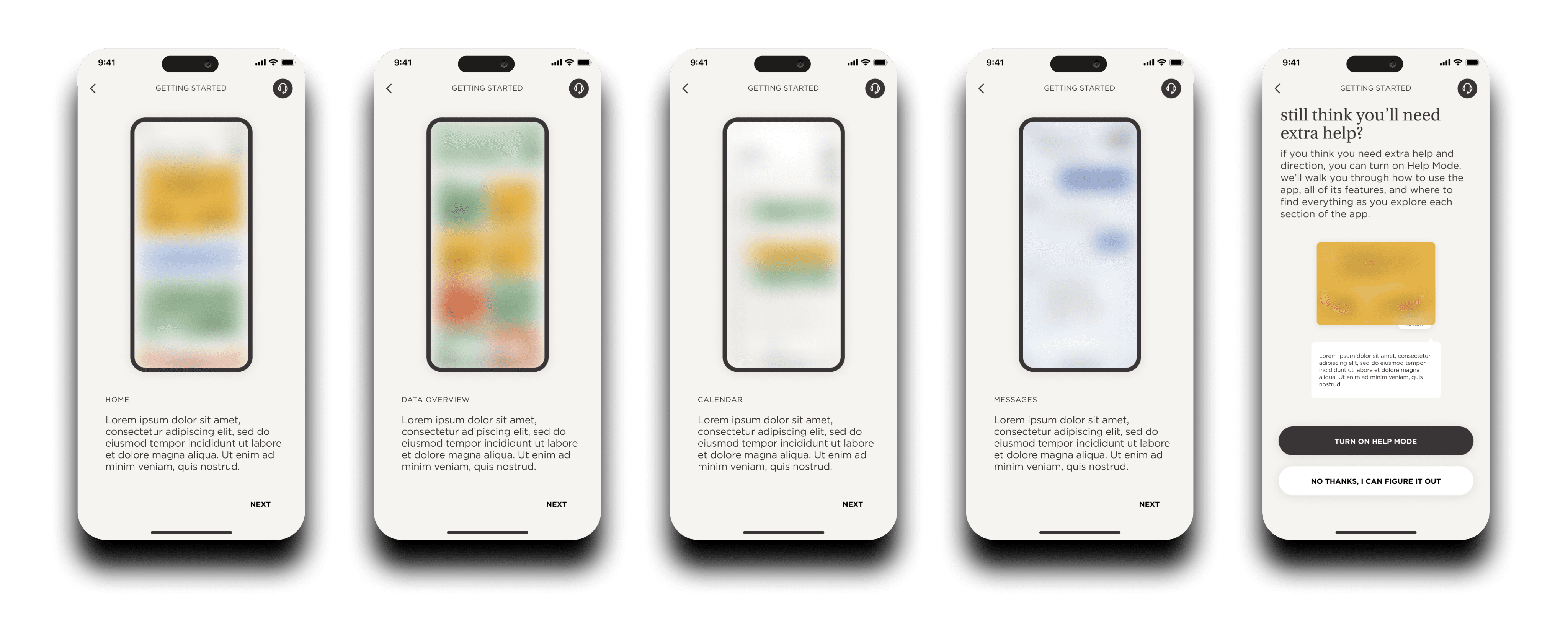


Because of the user feedback, I definitely put extra focus into the biometric graph page when designing the tutorial walkthroughs. As a more complicated screen, I made sure to highlight the most important areas, including what the data numbers represents, how to find more info, change views, and understand the meaning behind features. I tried to incorporate good contrast and simple navigation between overlays to focus on the accessibility aspect.
Because of the user feedback, I definitely put extra focus into the biometric graph page when designing the tutorial walkthroughs. As a more complicated screen, I made sure to highlight the most important areas, including what the data numbers represents, how to find more info, change views, and understand the meaning behind features. I tried to incorporate good contrast and simple navigation between overlays to focus on the accessibility aspect.
Because of the user feedback, I definitely put extra focus into the biometric graph page when designing the tutorial walkthroughs. As a more complicated screen, I made sure to highlight the most important areas, including what the data numbers represents, how to find more info, change views, and understand the meaning behind features. I tried to incorporate good contrast and simple navigation between overlays to focus on the accessibility aspect.


These are not all of the screens for this flow, but there is enough of them to understand the final design. We would keep iterating as more user data surfaced, adjusting text descriptions based on comprehension results.
These are not all of the screens for this flow, but there is enough of them to understand the final design. We would keep iterating as more user data surfaced, adjusting text descriptions based on comprehension results.
These are not all of the screens for this flow, but there is enough of them to understand the final design. We would keep iterating as more user data surfaced, adjusting text descriptions based on comprehension results.
Closing thoughts
Closing thoughts
Closing thoughts
After releasing the new feature in the latest version launch, we felt confident in the results, but I knew we might have to keep iterating the tutorial content as we continued to collect user data. This was one of our many projects for Well Works, and probably the most impactful one, one that I led and loved.
After releasing the new feature in the latest version launch, we felt confident in the results, but I knew we might have to keep iterating the tutorial content as we continued to collect user data. This was one of our many projects for Well Works, and probably the most impactful one, one that I led and loved.
After releasing the new feature in the latest version launch, we felt confident in the results, but I knew we might have to keep iterating the tutorial content as we continued to collect user data. This was one of our many projects for Well Works, and probably the most impactful one, one that I led and loved.
As a startup, I got to have an impact on their early product and on the experiences of their various user groups. Well Works continues to develop into a focused and exciting app, and I am excited to see that path.
As a startup, I got to have an impact on their early product and on the experiences of their various user groups. Well Works continues to develop into a focused and exciting app, and I am excited to see that path.
As a startup, I got to have an impact on their early product and on the experiences of their various user groups. Well Works continues to develop into a focused and exciting app, and I am excited to see that path.


