Vivianne Champagne
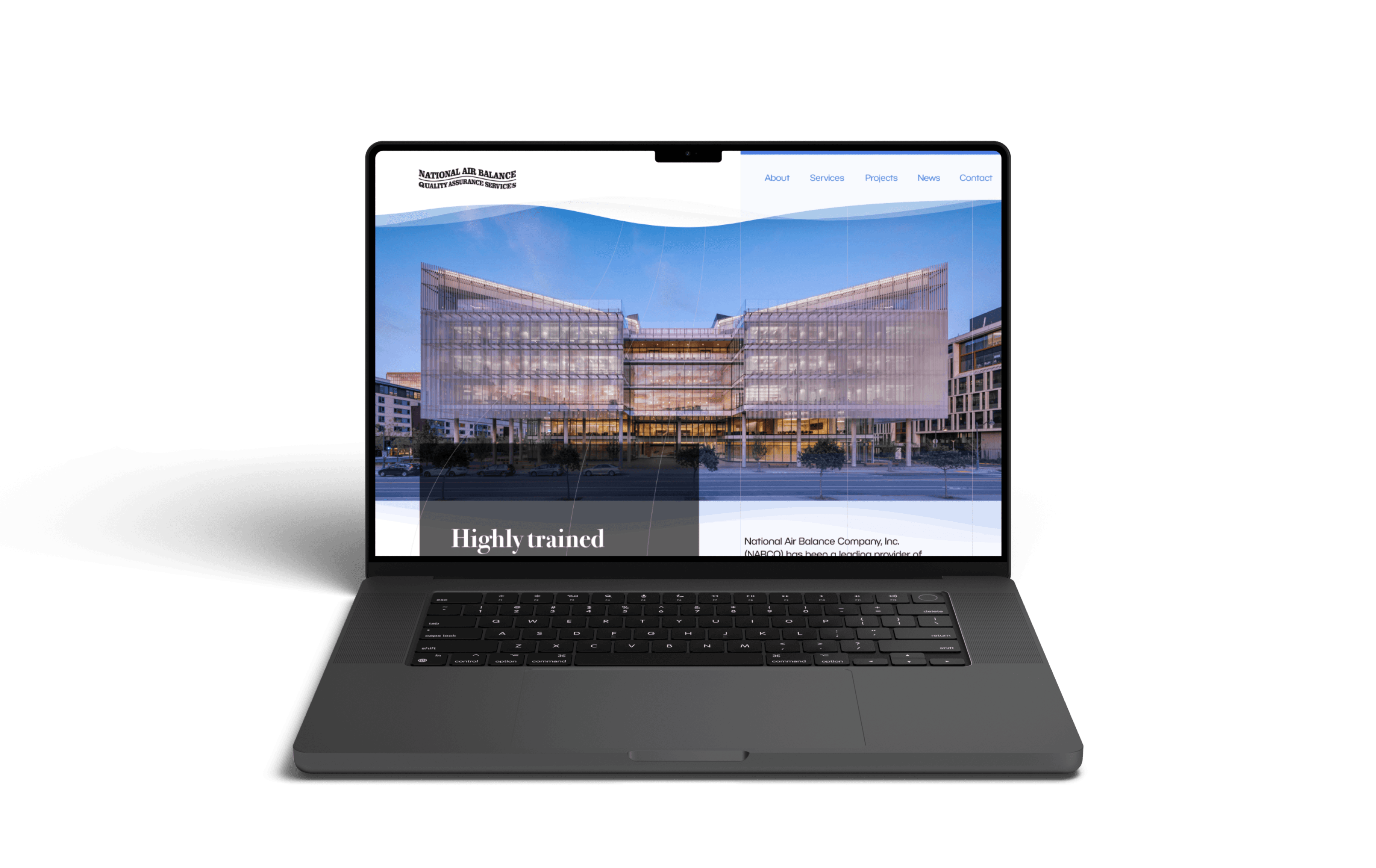


How might we modernize the branding and website while maintaining the company’s personality?
In this 3-month project in 2023, I reworked the branding and redesigned the website of a prominent Bay Area air balancing company. Our goal was to modernize it and keep up with the competition, so that they could increase the air of professionalism and the number of customers. For this end-to-end website development, the team consisted of myself and the agency’s creative director. For this case study, I’ll focus on the rebranding and expression of that on the home page.
UI
UX
Prototyping
Web Design
Branding
Redesign
The problem
The problem
The problem
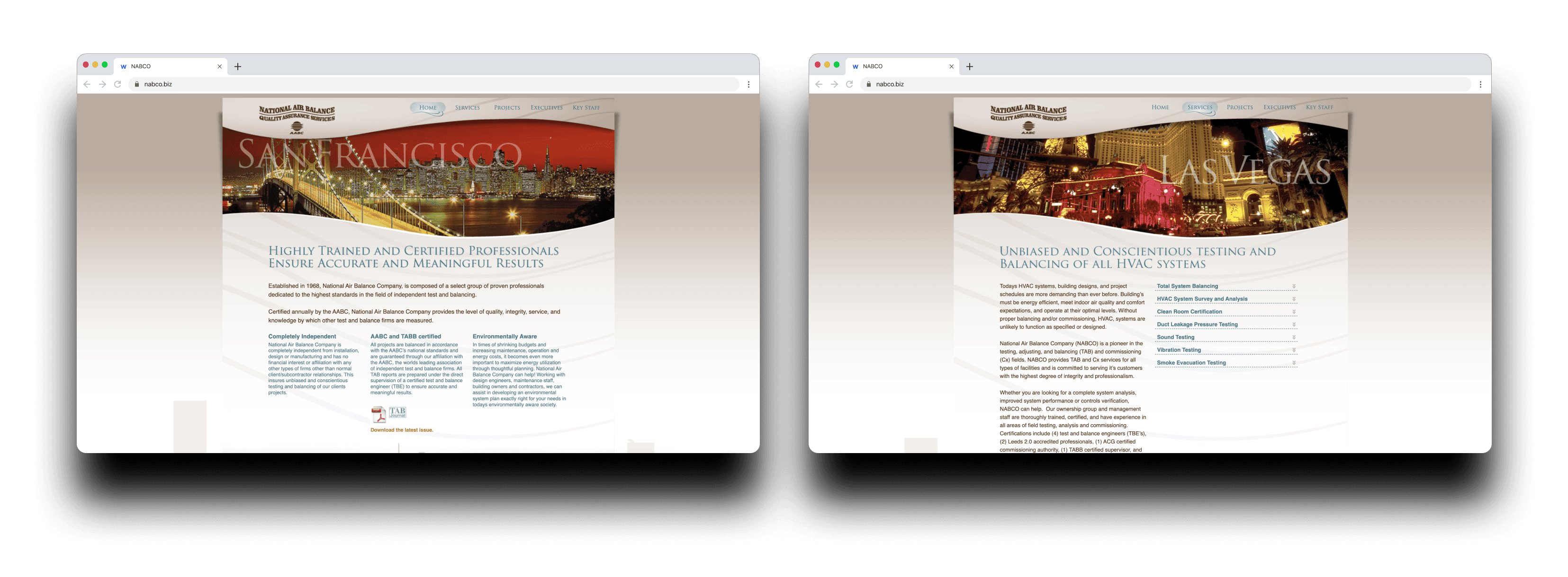
National Air Balance Co.’s website was very outdated; walls of text, harsh shadows, unattractive photos, and low usability. Their website is an important part of presenting to their current and potential customers, and at the time, they were just not presenting themselves visually as well as the competition.
It was important to not just update the site, but also the brand to elevate this company within their field, while not completely scrapping the existing content or visual aesthetic.


Initial exploration and research
Initial exploration and research
Initial exploration and research
The team at NABCO were adamant about keeping the heart of their current branding and personality. This meant they wanted to keep the same logo, and, while generally modernizing it, keep a sense of warmth.
The team at NABCO were adamant about keeping the heart of their current branding and personality. This meant they wanted to keep the same logo, and, while generally modernizing it, keep a sense of warmth.
The team at NABCO were adamant about keeping the heart of their current branding and personality. This meant they wanted to keep the same logo, and, while generally modernizing it, keep a sense of warmth.
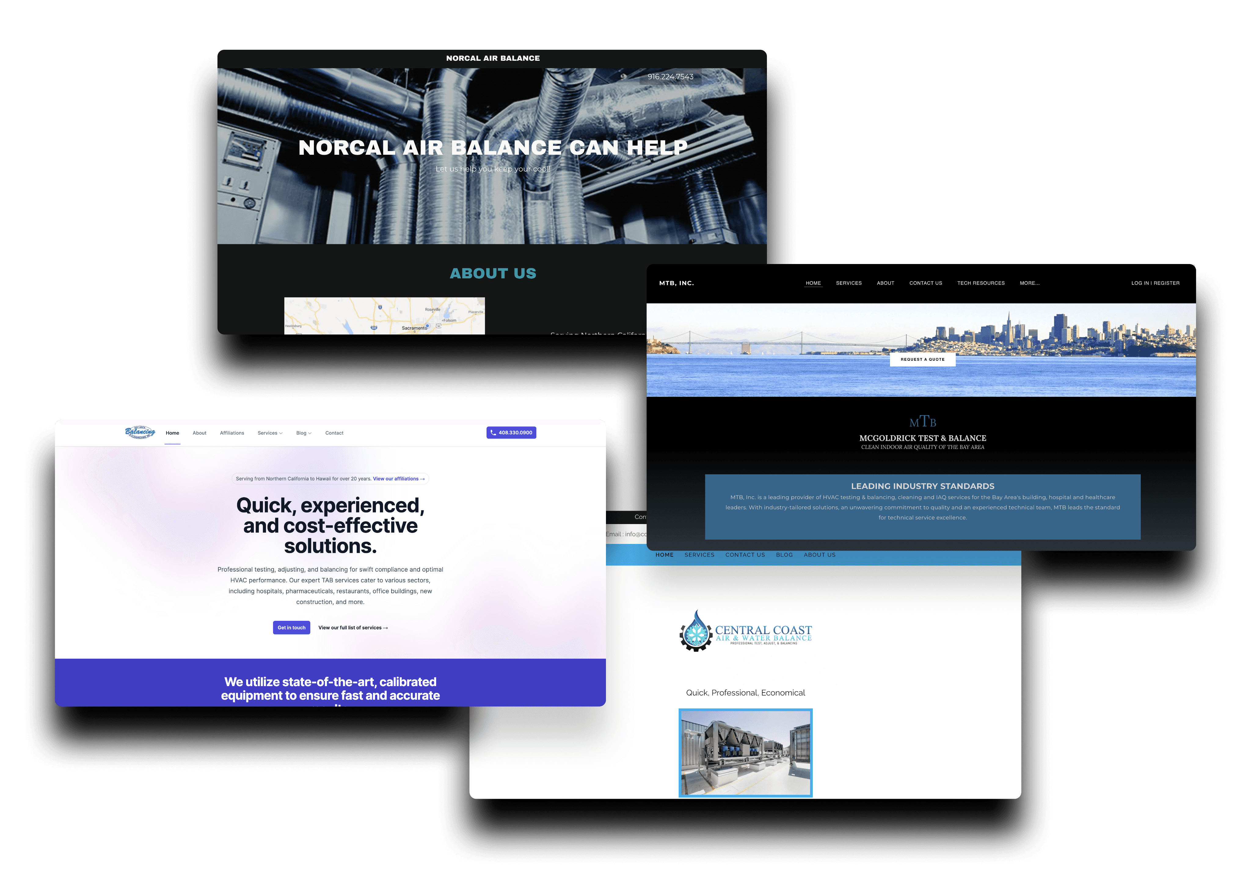


They almost all used blue as a primary color! I thought this would be a great direction for us too, because of the associations with the color as being trustworthy. We would just have to use a warmer approach to this color scheme.
Before jumping into a mood board, I looked over the competition’s websites to get a feel of their brand and style of presentation. The main thing I noticed was that some of them were trying to lean more into a modern look, and some tried to balance traditional and modern design.
I was hoping to stand out from competitors while also making the site feel at home within the field, so I wanted to use only one primary color, not feeling too traditional, and creating UI that felt different from the rest.
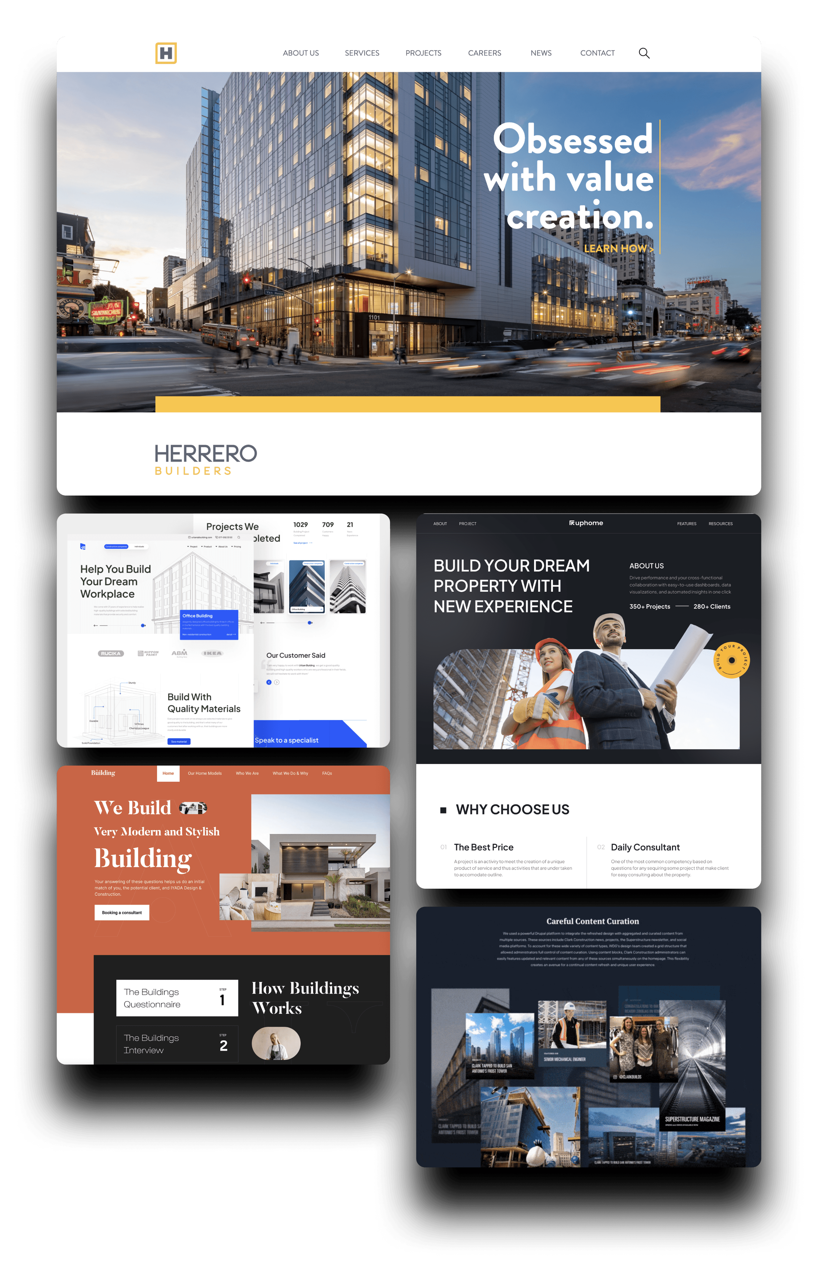


There were a lot of different options for aesthetics, and I was definitely a bit torn.
I love creating mood boards for design projects! It’s a great way to get ideas flowing, and it always helps me define a visual direction.
I love creating mood boards for design projects! It’s a great way to get ideas flowing, and it always helps me define a visual direction.
I love creating mood boards for design projects! It’s a great way to get ideas flowing, and it always helps me define a visual direction.
I gathered screenshots of similar sites to get an idea of which emotions or style we wanted to present. After showing this to the unsure team at NABCO, I created a some mockups to give them a better sense of direction.
I gathered screenshots of similar sites to get an idea of which emotions or style we wanted to present. After showing this to the unsure team at NABCO, I created a some mockups to give them a better sense of direction.
I gathered screenshots of similar sites to get an idea of which emotions or style we wanted to present. After showing this to the unsure team at NABCO, I created a some mockups to give them a better sense of direction.
Their team also had provided me with the information architecture they wanted. As a basic informational and portfolio site, the site was not going to be complicated, so I went into this knowing that branding was going to be the most important thing for drawing in customers.
Their team also had provided me with the information architecture they wanted. As a basic informational and portfolio site, the site was not going to be complicated, so I went into this knowing that branding was going to be the most important thing for drawing in customers.
Their team also had provided me with the information architecture they wanted. As a basic informational and portfolio site, the site was not going to be complicated, so I went into this knowing that branding was going to be the most important thing for drawing in customers.
Feedback
Feedback
Feedback
After all of our mood-boarding and ideation, I presented to the client two main directions: modern and abstract (using blues and minimalistic structuring), or traditional and similar to their current branding (using the same browns and sharp corners). I still tried to incorporate the wave graphics into both styles to match the theme.
After all of our mood-boarding and ideation, I presented to the client two main directions: modern and abstract (using blues and minimalistic structuring), or traditional and similar to their current branding (using the same browns and sharp corners). I still tried to incorporate the wave graphics into both styles to match the theme.
After all of our mood-boarding and ideation, I presented to the client two main directions: modern and abstract (using blues and minimalistic structuring), or traditional and similar to their current branding (using the same browns and sharp corners). I still tried to incorporate the wave graphics into both styles to match the theme.
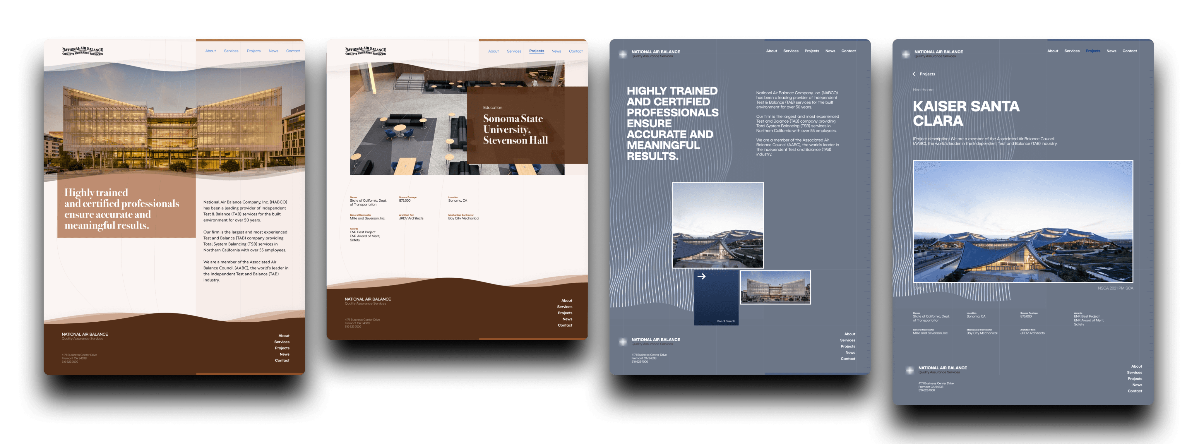


The brown color palette was definitely a bit overpowering and gave old west vibes- which wasn’t the visual direction we were hoping for. The modern style was my favorite! I wish I could’ve explored this style more, but I understand the stakeholders’ desire to go in a specific visual direction.
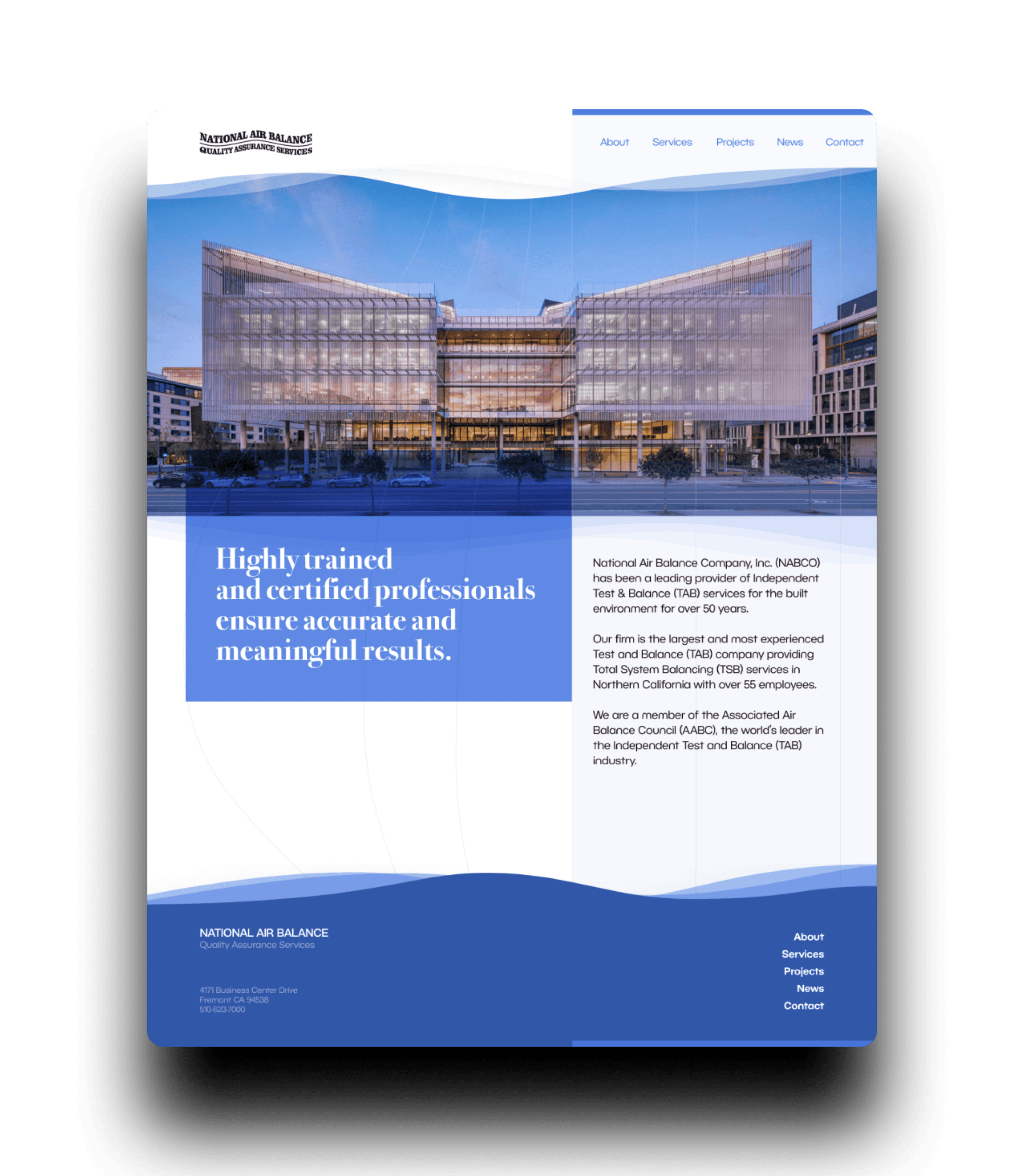


I also felt like there was maybe a bit too much blue, especially with the hero image being so blue as well.
The CEO, with the final say at the company, wanted to stay closer to the more traditional mockup, but their team started being curious about the color scheme. They wanted a touch of modernism through the blues seen in the mood board, so I took that and used the traditional design but changed the color scheme to pull it towards an updated look and away from the old west look.
The CEO, with the final say at the company, wanted to stay closer to the more traditional mockup, but their team started being curious about the color scheme. They wanted a touch of modernism through the blues seen in the mood board, so I took that and used the traditional design but changed the color scheme to pull it towards an updated look and away from the old west look.
The CEO, with the final say at the company, wanted to stay closer to the more traditional mockup, but their team started being curious about the color scheme. They wanted a touch of modernism through the blues seen in the mood board, so I took that and used the traditional design but changed the color scheme to pull it towards an updated look and away from the old west look.
But as their team got to mull over this version, they realized that the heavy use of blue was actually a bit too strong, and they asked to make blue a secondary color instead while making black a primary color, which still kept us in a modern feel.
But as their team got to mull over this version, they realized that the heavy use of blue was actually a bit too strong, and they asked to make blue a secondary color instead while making black a primary color, which still kept us in a modern feel.
But as their team got to mull over this version, they realized that the heavy use of blue was actually a bit too strong, and they asked to make blue a secondary color instead while making black a primary color, which still kept us in a modern feel.
Final design
Final design
Final design
Branding
Branding
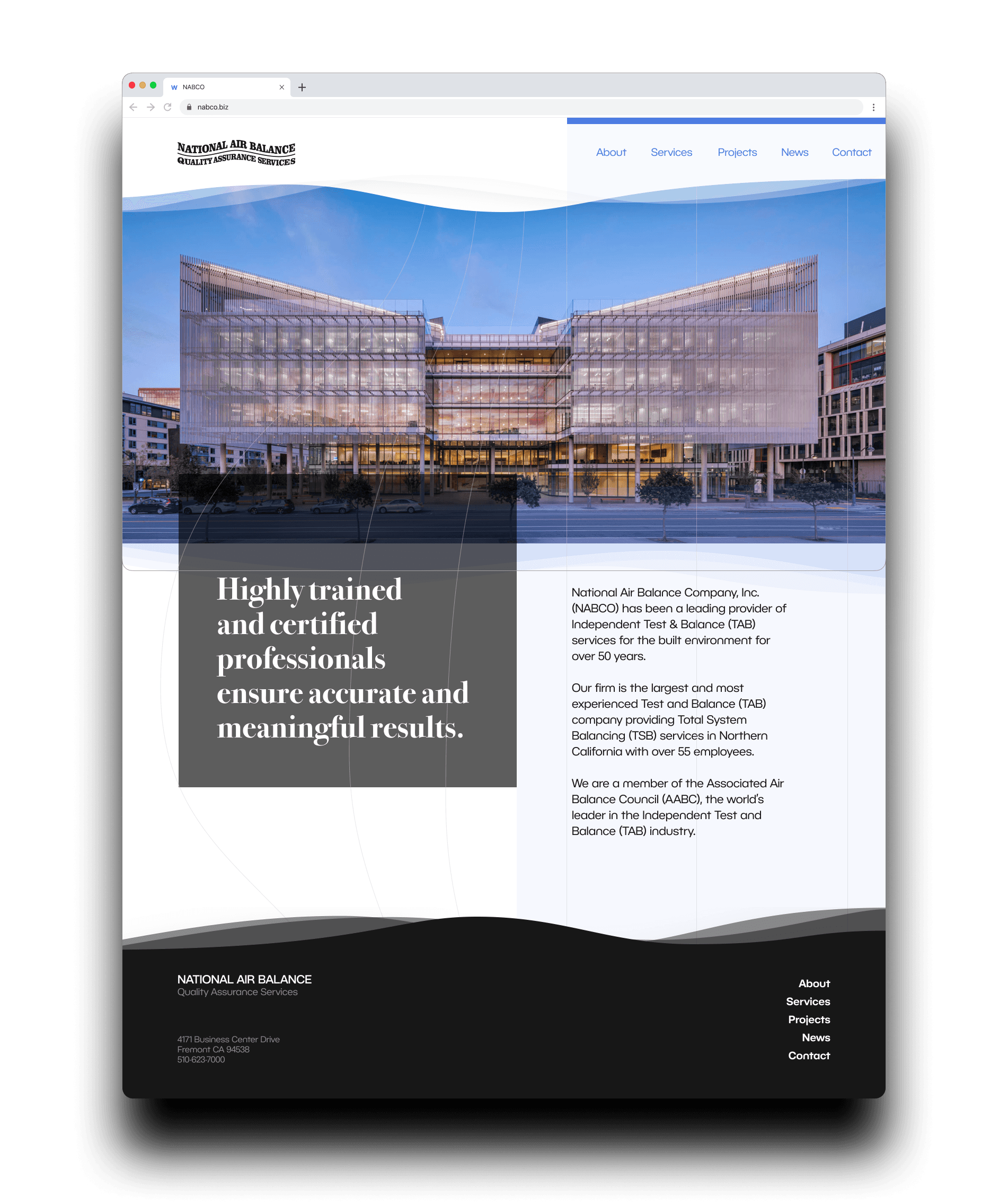
In our final color palette, I wanted to use a bright and light blue to compliment and contrast the black color that we wanted to use more of. With black and white being the stars of the design, and the bright shade of blue used for titles, buttons, and accent colors, it would create that sense of modernism that we were looking for.
In our final color palette, I wanted to use a bright and light blue to compliment and contrast the black color that we wanted to use more of. With black and white being the stars of the design, and the bright shade of blue used for titles, buttons, and accent colors, it would create that sense of modernism that we were looking for.
In our final color palette, I wanted to use a bright and light blue to compliment and contrast the black color that we wanted to use more of. With black and white being the stars of the design, and the bright shade of blue used for titles, buttons, and accent colors, it would create that sense of modernism that we were looking for.
We defined the branding through identity statements to put in the brand guidelines and to use within the design.
We defined the branding through identity statements to put in the brand guidelines and to use within the design.
We defined the branding through identity statements to put in the brand guidelines and to use within the design.
1
The established modernist
The established modernist
The established modernist
Curated sense of modernism within a long-standing, established organization. Sharp corners, black and white theme, and a touch of bright blue to foster this balance.
Curated sense of modernism within a long-standing, established organization. Sharp corners, black and white theme, and a touch of bright blue to foster this balance.
2
Classic typography
Classic typography
Classic typography
A bolded serif for headers for traditionalism, and a rounded sans serif for body text for playful modernism.
A bolded serif for headers for traditionalism, and a rounded sans serif for body text for playful modernism.
3
Light and airy
Light and airy
Light and airy
Subtle wave graphics, empty space, and a light amount of contrast.
Subtle wave graphics, empty space, and a light amount of contrast.


Home page
Home page
I used the designs from the past iterations and the feedback following them to meet the stakeholder needs, create the perfected brand identity, and reach this final aesthetic.
I used the designs from the past iterations and the feedback following them to meet the stakeholder needs, create the perfected brand identity, and reach this final aesthetic.
I used the designs from the past iterations and the feedback following them to meet the stakeholder needs, create the perfected brand identity, and reach this final aesthetic.
Using sharpness, simplicity, and block structuring made this feel traditional established, and clear cut. But adding elements of modernism, like black and white contrast, rounded sans serif typeface, and empty space, made the design have the balance that their team was hoping for.
Using sharpness, simplicity, and block structuring made this feel traditional established, and clear cut. But adding elements of modernism, like black and white contrast, rounded sans serif typeface, and empty space, made the design have the balance that their team was hoping for.
Using sharpness, simplicity, and block structuring made this feel traditional established, and clear cut. But adding elements of modernism, like black and white contrast, rounded sans serif typeface, and empty space, made the design have the balance that their team was hoping for.
Closing thoughts
Closing thoughts
Closing thoughts
We worked to launch this website with our developer at Awake, and it ended up great. NABCO’s team was happy with the results and I think we were successful in creating the image that they were looking for.
We worked to launch this website with our developer at Awake, and it ended up great. NABCO’s team was happy with the results and I think we were successful in creating the image that they were looking for.
We worked to launch this website with our developer at Awake, and it ended up great. NABCO’s team was happy with the results and I think we were successful in creating the image that they were looking for.
Simple web designs can be soothing in a way, and the client was wonderful to work with. I loved working on this project and I’m glad I got to do it.
Simple web designs can be soothing in a way, and the client was wonderful to work with. I loved working on this project and I’m glad I got to do it.
Simple web designs can be soothing in a way, and the client was wonderful to work with. I loved working on this project and I’m glad I got to do it.
See the full site
See the full site
Up next
Up next
Up next

