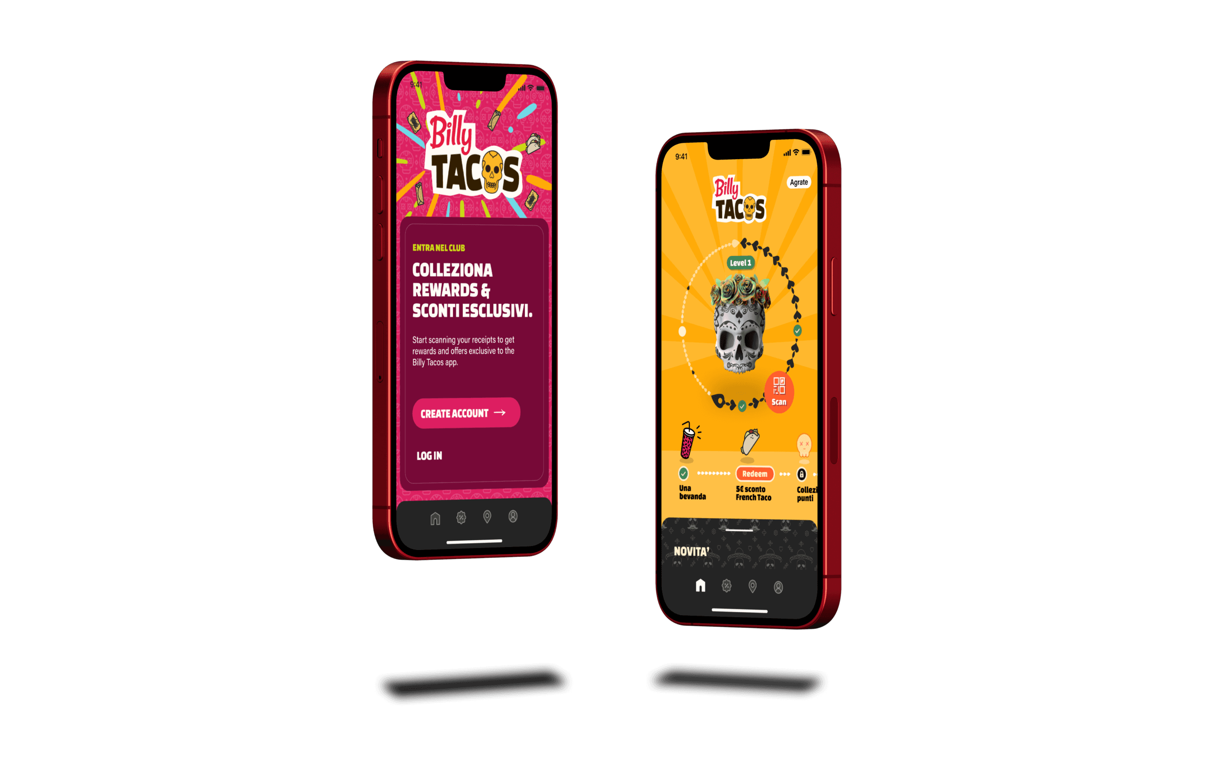


How might we use gamification to grow the number of consistent restaurant customers?
Over 5 months in 2022, we designed a mobile app for a Mexican fast food chain based in Italy. They wanted a rewards app that would allow customers to collect and use coupons. Billy Tacos wanted to increase their number of consistent, returning customers to increase sales. The team for this end-to-end project consisted of myself and the agency’s creative director, and this case study focuses on building the rewards section of the app.
UI
UX
IA
Design Systems
Mobile Design
Illustration
Food and Rewards
B2C
How might we use gamification to grow the number of consistent restaurant customers?
This was a 1 month project during 2023 where we designed a client management dashboard, tailoring the app to sales associates for The Row. Alpha is a growing enterprise startup, aiming to support sales teams of luxury fashion brands and increase their sales through customer management.
The team for this project consisted of myself, a product manager, and our creative director. This case study focuses on redesigning the task management system for sales associates to view, create, and organize tasks related to one client.
UI
UX
IA
Design Systems
Mobile Design
Illustration
Food and Rewards
B2C
The problem
The problem
The problem
Billy Tacos, an established brand with 25+ locations throughout Italy, wanted to create an app for customers to collect and use rewards as they kept coming back. Most of their customers, based on their research, were sporadic customers.
They thought that doing this would increase their number of frequent returning customers, and that was the demographic they wanted to target through this app. Since Billy Tacos was an established brand, we had to develop and expand the existing visual brand and aesthetic.
Initial exploration and research
Initial exploration and research
Initial exploration and research
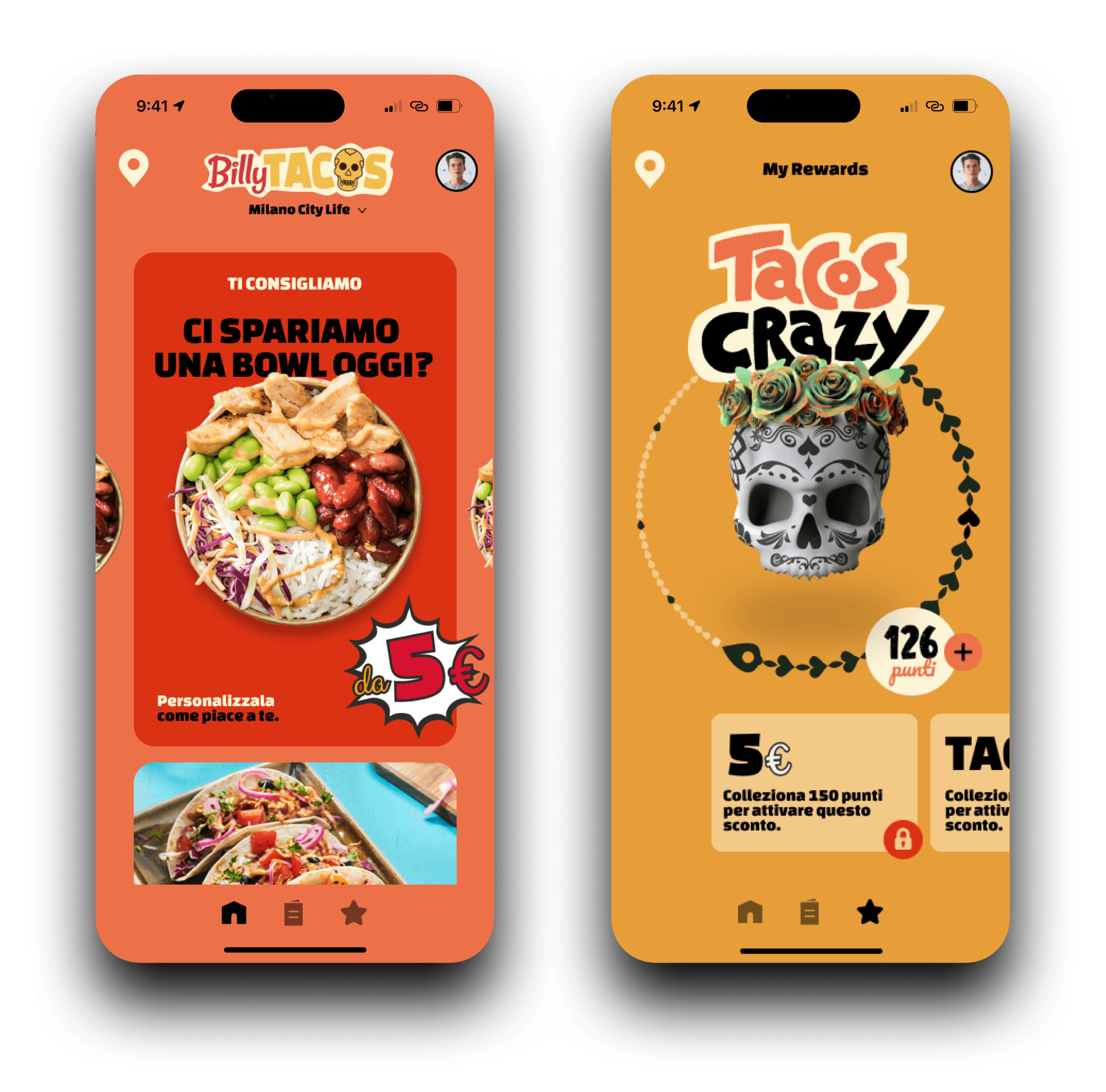


This was a great starting point! The colors really made this feel different and like a bit of a challenge. I definitely got excited about exploring this structure and theme more.
Our creative director gave me two concept mockups that he did for the pitch presentation to the client. I started with developing the information architecture and creating extensive user flows.
It was important to get a feel of what similar apps were doing, so that it could compete at the same level. I dove into doing a competitor analysis of the Chipotle and Peet’s Coffee reward apps.
Chipotle
Chipotle
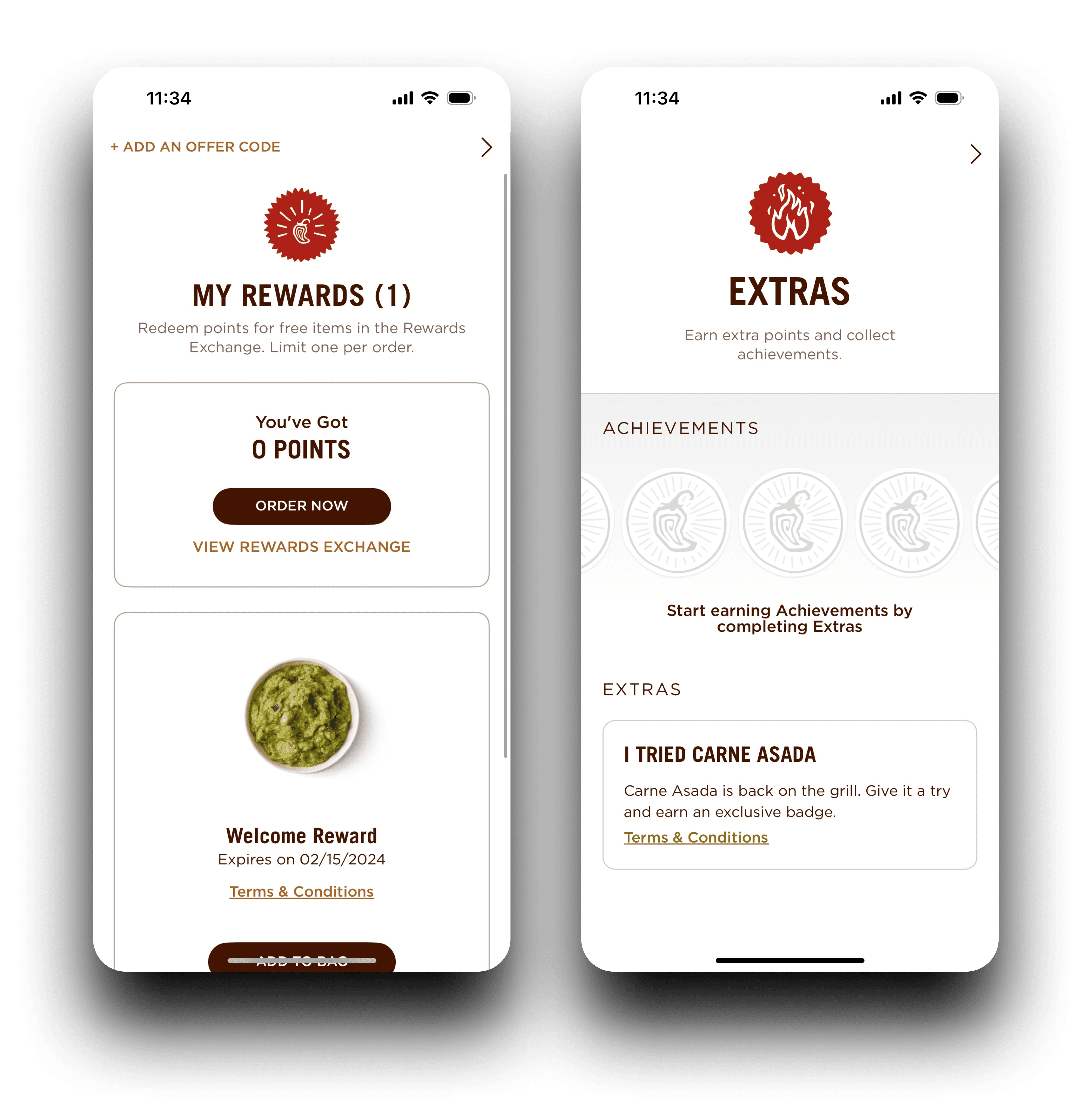
I noticed that Chipotle’s rewards app was more simplistic, with bare bones designs and little to no gamification. Billy Tacos at this stage had limited features, so being simple was important. The achievements were presented in a way similar to our concept designs, but we knew we wanted to step up the gamification and visual identity.
I noticed that Chipotle’s rewards app was more simplistic, with bare bones designs and little to no gamification. Billy Tacos at this stage had limited features, so being simple was important. The achievements were presented in a way similar to our concept designs, but we knew we wanted to step up the gamification and visual identity.
I noticed that Chipotle’s rewards app was more simplistic, with bare bones designs and little to no gamification. Billy Tacos at this stage had limited features, so being simple was important. The achievements were presented in a way similar to our concept designs, but we knew we wanted to step up the gamification and visual identity.


Peet’s Coffee
Peet’s Coffee
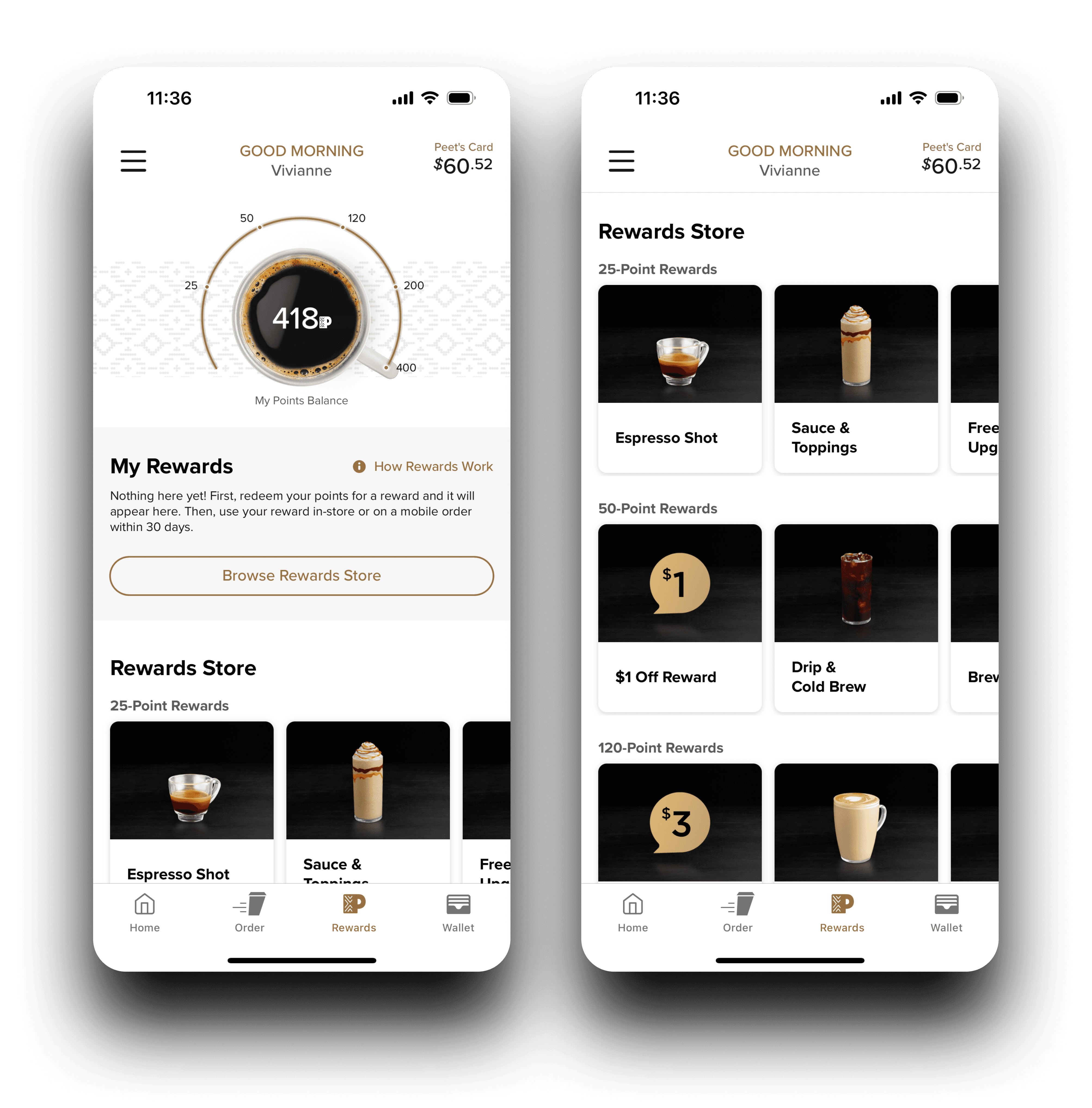
The Peet’s Coffee rewards app took a more gamified but professional approach. We knew the visual identity was going to be much more bright and playful, so I really focused on the structure here. Visually displaying progress with the coffee cup and progress meter in the center was something we wanted to include in Billy Tacos’ app.
The Peet’s Coffee rewards app took a more gamified but professional approach. We knew the visual identity was going to be much more bright and playful, so I really focused on the structure here. Visually displaying progress with the coffee cup and progress meter in the center was something we wanted to include in Billy Tacos’ app.
The Peet’s Coffee rewards app took a more gamified but professional approach. We knew the visual identity was going to be much more bright and playful, so I really focused on the structure here. Visually displaying progress with the coffee cup and progress meter in the center was something we wanted to include in Billy Tacos’ app.


Objectives
Objectives
Objectives
1
1
1
Create an easy to use rewards system using the tools available for the physical locations.
Create an easy to use rewards system using the tools available for the physical locations.
Create an easy to use rewards system using the tools available for the physical locations.
The restaurants’ scanning systems were not yet at the same level as those of Chipotle or Peet’s Coffee. Their systems wouldn’t be able to handle app payments quite yet, so we had to work with tailoring a scanning system for them.
The restaurants’ scanning systems were not yet at the same level as those of Chipotle or Peet’s Coffee. Their systems wouldn’t be able to handle app payments quite yet, so we had to work with tailoring a scanning system for them.
The restaurants’ scanning systems were not yet at the same level as those of Chipotle or Peet’s Coffee. Their systems wouldn’t be able to handle app payments quite yet, so we had to work with tailoring a scanning system for them.
2
2
2
Design a gamified experience to encourage consisting, returning customers.
Design a gamified experience to encourage consisting, returning customers.
Design a gamified experience to encourage consisting, returning customers.
The goal here was to increase sales from existing customers, so we wanted to focus on how to keep them coming back to the app.
The goal here was to increase sales from existing customers, so we wanted to focus on how to keep them coming back to the app.
The goal here was to increase sales from existing customers, so we wanted to focus on how to keep them coming back to the app.
Feedback
Feedback
Feedback
Our creative director and I met regularly with the Billy Tacos’ executive team to discuss our progress in the project. They gave feedback as we went through the project, and they were happy with the concept designs and loved the branding direction we were going in, only offering a few tweaks here and there. However, they had one primary complaint.
Our creative director and I met regularly with the Billy Tacos’ executive team to discuss our progress in the project. They gave feedback as we went through the project, and they were happy with the concept designs and loved the branding direction we were going in, only offering a few tweaks here and there. However, they had one primary complaint.
Our creative director and I met regularly with the Billy Tacos’ executive team to discuss our progress in the project. They gave feedback as we went through the project, and they were happy with the concept designs and loved the branding direction we were going in, only offering a few tweaks here and there. However, they had one primary complaint.
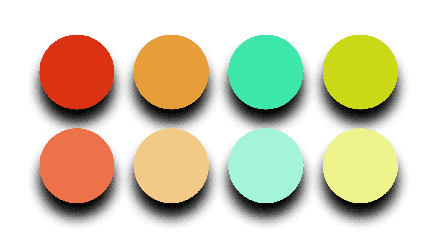


This color palette was so much fun to design! I took inspiration from vibrant and colorful photos of Latin American cities.
Originally, we were creating a universal color palette for the app. This allowed a range of colors that were more well balanced, but the Billy Tacos’ executive team felt that it didn’t visually represent upgrading to a new level like they had imagined. They wanted to represent it app wide, so that it might feel more like a game.
Originally, we were creating a universal color palette for the app. This allowed a range of colors that were more well balanced, but the Billy Tacos’ executive team felt that it didn’t visually represent upgrading to a new level like they had imagined. They wanted to represent it app wide, so that it might feel more like a game.
Originally, we were creating a universal color palette for the app. This allowed a range of colors that were more well balanced, but the Billy Tacos’ executive team felt that it didn’t visually represent upgrading to a new level like they had imagined. They wanted to represent it app wide, so that it might feel more like a game.
The feedback pushed me to create 7 different color palettes for 7 levels that fit the stakeholder ideas and needs.
The feedback pushed me to create 7 different color palettes for 7 levels that fit the stakeholder ideas and needs.
The feedback pushed me to create 7 different color palettes for 7 levels that fit the stakeholder ideas and needs.
Final design
Final design
Final design
Color palette
Because of the defined level system, and because of the wishes of the stakeholders at Billy Tacos, we pivoted towards a new color palette at every level to visually express the level progression.
Because of the defined level system, and because of the wishes of the stakeholders at Billy Tacos, we pivoted towards a new color palette at every level to visually express the level progression.
Because of the defined level system, and because of the wishes of the stakeholders at Billy Tacos, we pivoted towards a new color palette at every level to visually express the level progression.
We had to work with the stakeholder needs in this case, so I developed an individual color palette for each level, all very bright to match the vibrant look we were going for. The primary colors for the 7 levels are shown below.
We had to work with the stakeholder needs in this case, so I developed an individual color palette for each level, all very bright to match the vibrant look we were going for. The primary colors for the 7 levels are shown below.
We had to work with the stakeholder needs in this case, so I developed an individual color palette for each level, all very bright to match the vibrant look we were going for. The primary colors for the 7 levels are shown below.


Rewards
After defining the features and visual hierarchy for the rewards page, my goal was to make the progress circle the primary focus. This made it feel more gamified, and enticed the user to finish each goal.
After defining the features and visual hierarchy for the rewards page, my goal was to make the progress circle the primary focus. This made it feel more gamified, and enticed the user to finish each goal.
After defining the features and visual hierarchy for the rewards page, my goal was to make the progress circle the primary focus. This made it feel more gamified, and enticed the user to finish each goal.
I included the progress, ability to scan receipt rewards, item unlocking, current level, and brand news. All of these kept it simple enough, but also created small, achievable steps that encouraged repeat use.
I included the progress, ability to scan receipt rewards, item unlocking, current level, and brand news. All of these kept it simple enough, but also created small, achievable steps that encouraged repeat use.
I included the progress, ability to scan receipt rewards, item unlocking, current level, and brand news. All of these kept it simple enough, but also created small, achievable steps that encouraged repeat use.
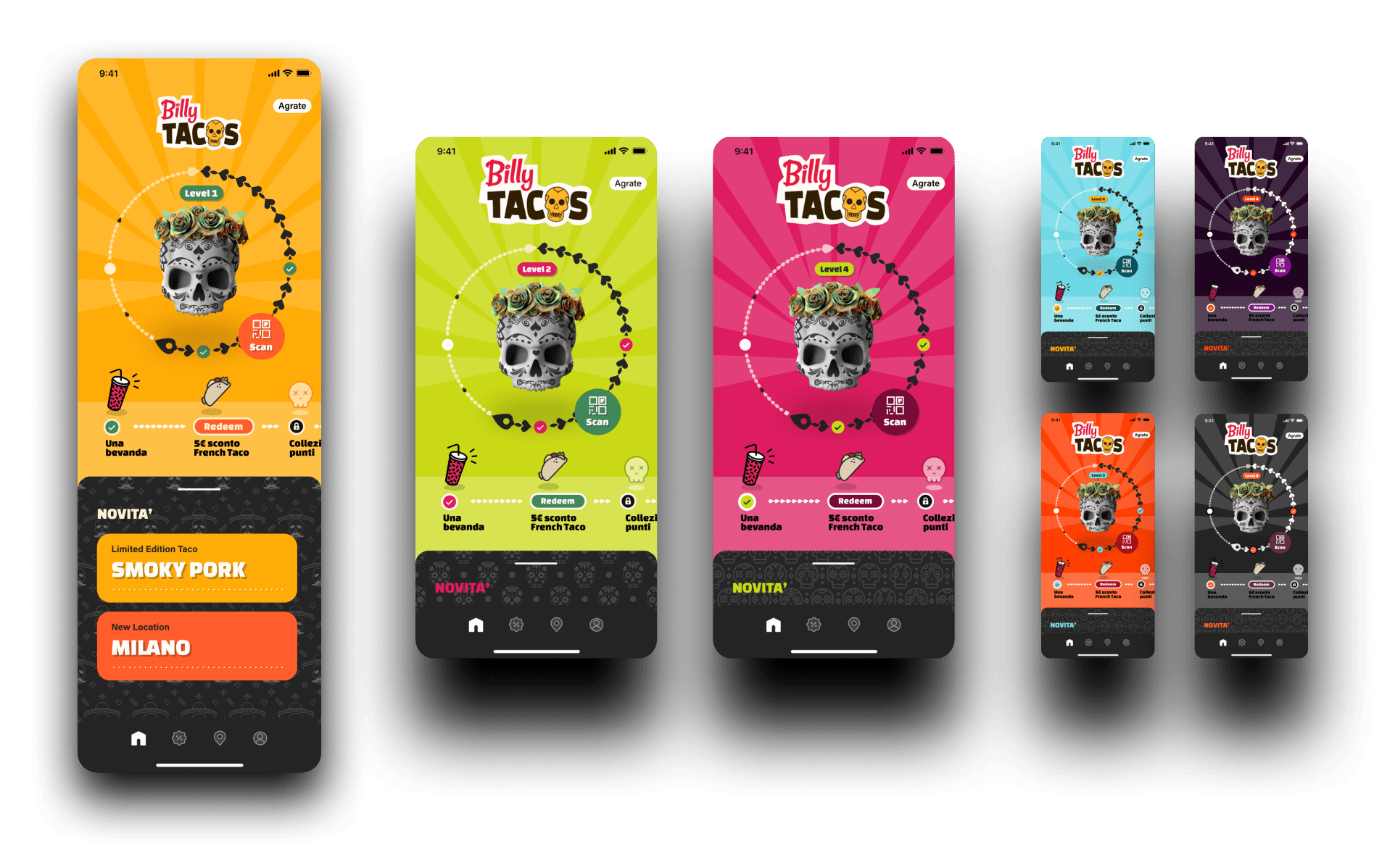


I created illustrations to represent the more secondary details, like the unlocked and locked achievements, and to match the identity we were going for. It added to the feeling of playing a game, which was an important goal!
I created illustrations to represent the more secondary details, like the unlocked and locked achievements, and to match the identity we were going for. It added to the feeling of playing a game, which was an important goal!
I created illustrations to represent the more secondary details, like the unlocked and locked achievements, and to match the identity we were going for. It added to the feeling of playing a game, which was an important goal!
The illustrations were my favorite! I designed them to be cute and fun just like the branding.
Scanning new points
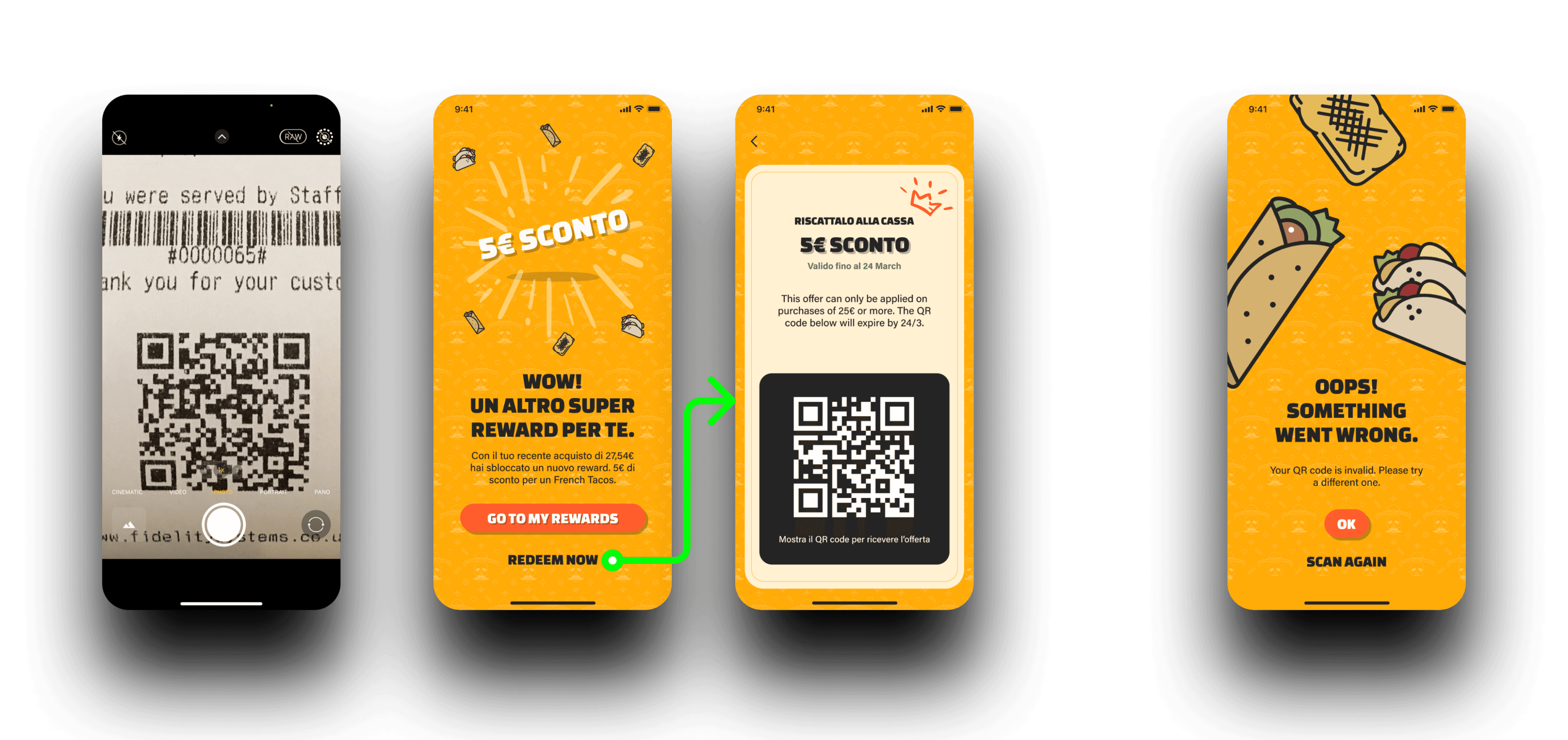
At this time, customers could only scan QR codes on their receipts to add to their points, so I created a simple flow incorporating two flows: redeeming immediately or return to the main rewards screen. I kept that same visual style going to emotionally reward customers for ordering at Billy Tacos.
At this time, customers could only scan QR codes on their receipts to add to their points, so I created a simple flow incorporating two flows: redeeming immediately or return to the main rewards screen. I kept that same visual style going to emotionally reward customers for ordering at Billy Tacos.
At this time, customers could only scan QR codes on their receipts to add to their points, so I created a simple flow incorporating two flows: redeeming immediately or return to the main rewards screen. I kept that same visual style going to emotionally reward customers for ordering at Billy Tacos.


Closing thoughts
Closing thoughts
Closing thoughts
After our final reviews with the executive team at Billy Tacos, they were really satisfied with the end product, and the designs were delivered to our engineering team at Awake. Because user testing doesn’t end after development, Billy Tacos in the following months reported app feedback from customers, so that we could address any issues.
After our final reviews with the executive team at Billy Tacos, they were really satisfied with the end product, and the designs were delivered to our engineering team at Awake. Because user testing doesn’t end after development, Billy Tacos in the following months reported app feedback from customers, so that we could address any issues.
After our final reviews with the executive team at Billy Tacos, they were really satisfied with the end product, and the designs were delivered to our engineering team at Awake. Because user testing doesn’t end after development, Billy Tacos in the following months reported app feedback from customers, so that we could address any issues.
I’d never designed for a gamified product before, or even a rewards based product. Especially in such a bright color palette! This was an exciting project and I was glad to be a part of it.
I’d never designed for a gamified product before, or even a rewards based product. Especially in such a bright color palette! This was an exciting project and I was glad to be a part of it.
I’d never designed for a gamified product before, or even a rewards based product. Especially in such a bright color palette! This was an exciting project and I was glad to be a part of it.


