

How might we optimize conversion rate through effective branding?
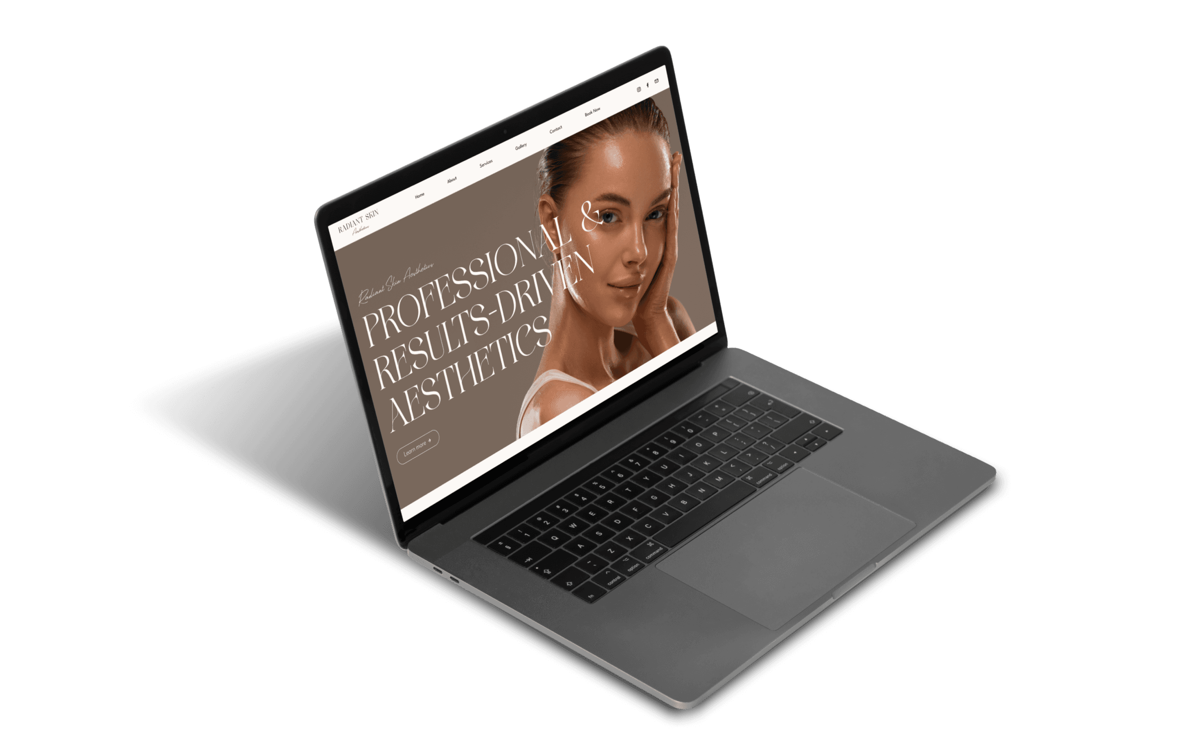
Over 4 weeks in early 2024, I worked to create the brand identity and website of a newly established esthetician business. RSA aimed to develop a strong brand and visual presence to generate an influx of customers. I worked on this project individually, leading it from research stages to shipping, while collaborating with RSA’s founder to develop her vision.
UI
UX
Branding
Prototyping
Web Design
Beauty
How might we optimize conversion rate through effective branding?
This was a 1 month project during 2023 where we designed a client management dashboard, tailoring the app to sales associates for The Row. Alpha is a growing enterprise startup, aiming to support sales teams of luxury fashion brands and increase their sales through customer management.
The team for this project consisted of myself, a product manager, and our creative director. This case study focuses on redesigning the task management system for sales associates to view, create, and organize tasks related to one client.
UI
UX
Branding
Prototyping
Web Design
Beauty
The problem
The problem
The problem
As a very young company, Radiant Skin Aesthetics had no branding, office, or website. The founder knew she wanted to balance a professional appearance with a sense of femininity and beauty, but all she had was a Pinterest board to start. Starting the business off strong was also a concern, and while she planned to market the business through social media, she wanted to make sure that customers were likely to book right away as she got that first initial wave of viewers to the site.
As a very young company, Radiant Skin Aesthetics had no branding, office, or website. The founder knew she wanted to balance a professional appearance with a sense of femininity and beauty, but all she had was a Pinterest board to start. Starting the business off strong was also a concern, and while she planned to market the business through social media, she wanted to make sure that customers were likely to book right away as she got that first initial wave of viewers to the site.
As a very young company, Radiant Skin Aesthetics had no branding, office, or website. The founder knew she wanted to balance a professional appearance with a sense of femininity and beauty, but all she had was a Pinterest board to start. Starting the business off strong was also a concern, and while she planned to market the business through social media, she wanted to make sure that customers were likely to book right away as she got that first initial wave of viewers to the site.
Initial exploration and research
Initial exploration and research
Initial exploration and research
Inspiration
Inspiration
Inspiration
I always love starting with a mood board and competitor analysis. The client first walked me through her Pinterest board to explain her inspiration. It was completely based on neutrals, minimalism, and delicate beauty, so I started to get a good idea of what emotions she wanted to portray.
I always love starting with a mood board and competitor analysis. The client first walked me through her Pinterest board to explain her inspiration. It was completely based on neutrals, minimalism, and delicate beauty, so I started to get a good idea of what emotions she wanted to portray.
I always love starting with a mood board and competitor analysis. The client first walked me through her Pinterest board to explain her inspiration. It was completely based on neutrals, minimalism, and delicate beauty, so I started to get a good idea of what emotions she wanted to portray.
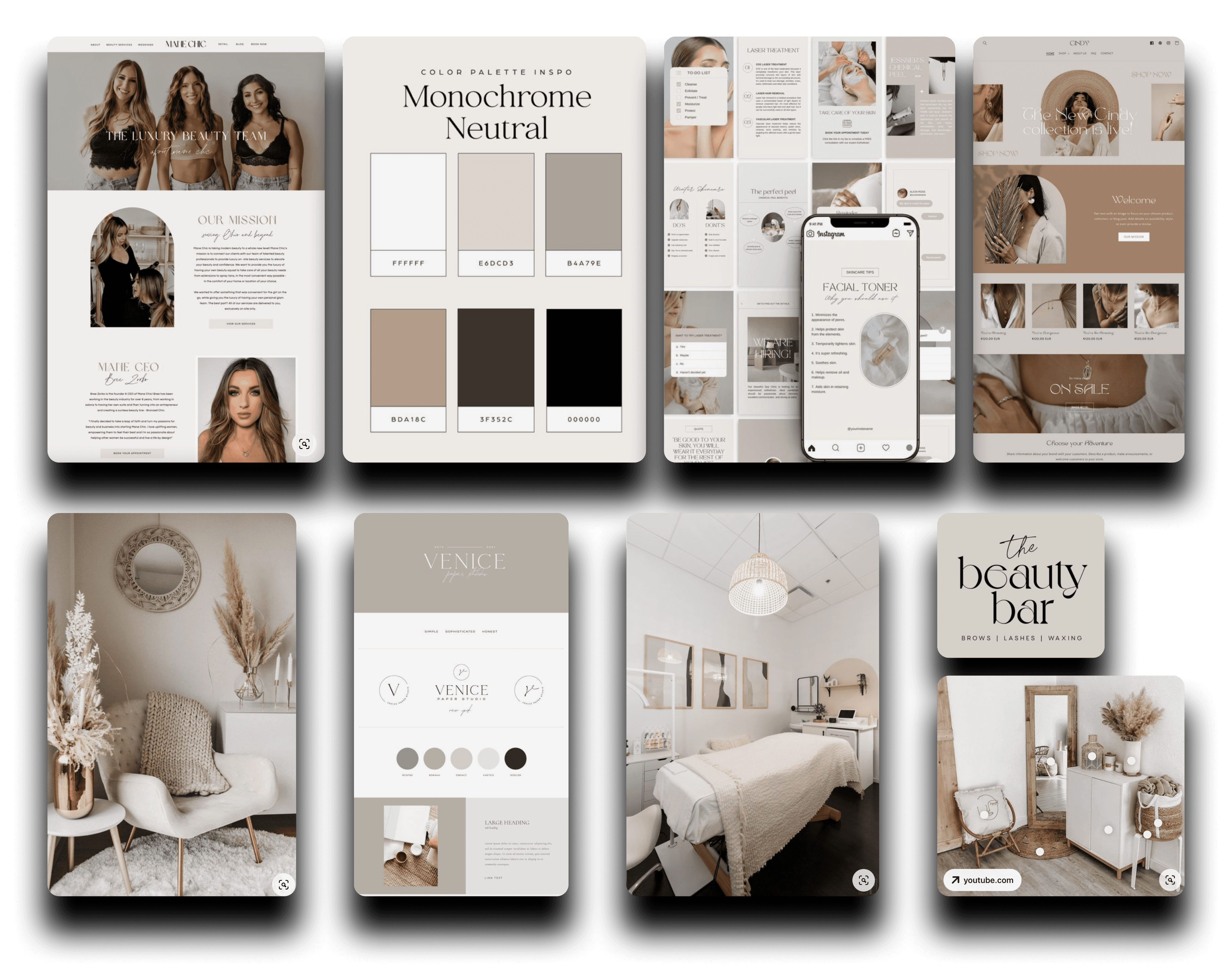


I'd never gotten to design in this style before! I loved how dainty and feminine it is.
She sent me the website of a successful, established esthetician business with a strong brand identity that she thought was a great example, aesthetically and professionally.
She sent me the website of a successful, established esthetician business with a strong brand identity that she thought was a great example, aesthetically and professionally.
She sent me the website of a successful, established esthetician business with a strong brand identity that she thought was a great example, aesthetically and professionally.
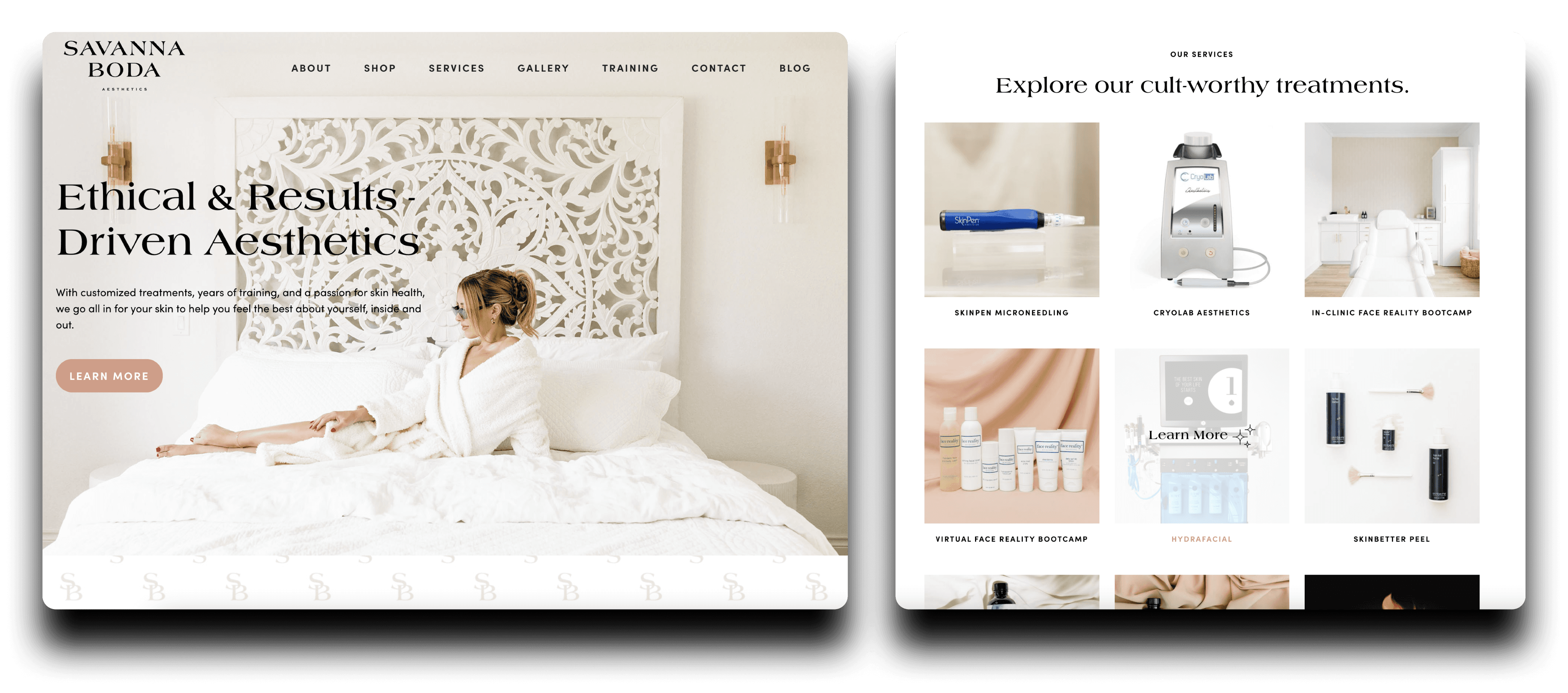


Takeaways
Takeaways
1
1
1
Simple and beautiful UI
Simple and beautiful UI
2
2
2
Professional aura
Professional aura
3
3
3
Muted colors
Muted colors
4
4
4
Abundant images
Abundant images
5
5
5
Casual language
Casual language
Usability issues
Usability issues
1
1
1
Very information-heavy
Very information-heavy
2
2
2
Too many different pages
Too many different pages
3
3
3
Not very easy to navigate
Not very easy to navigate
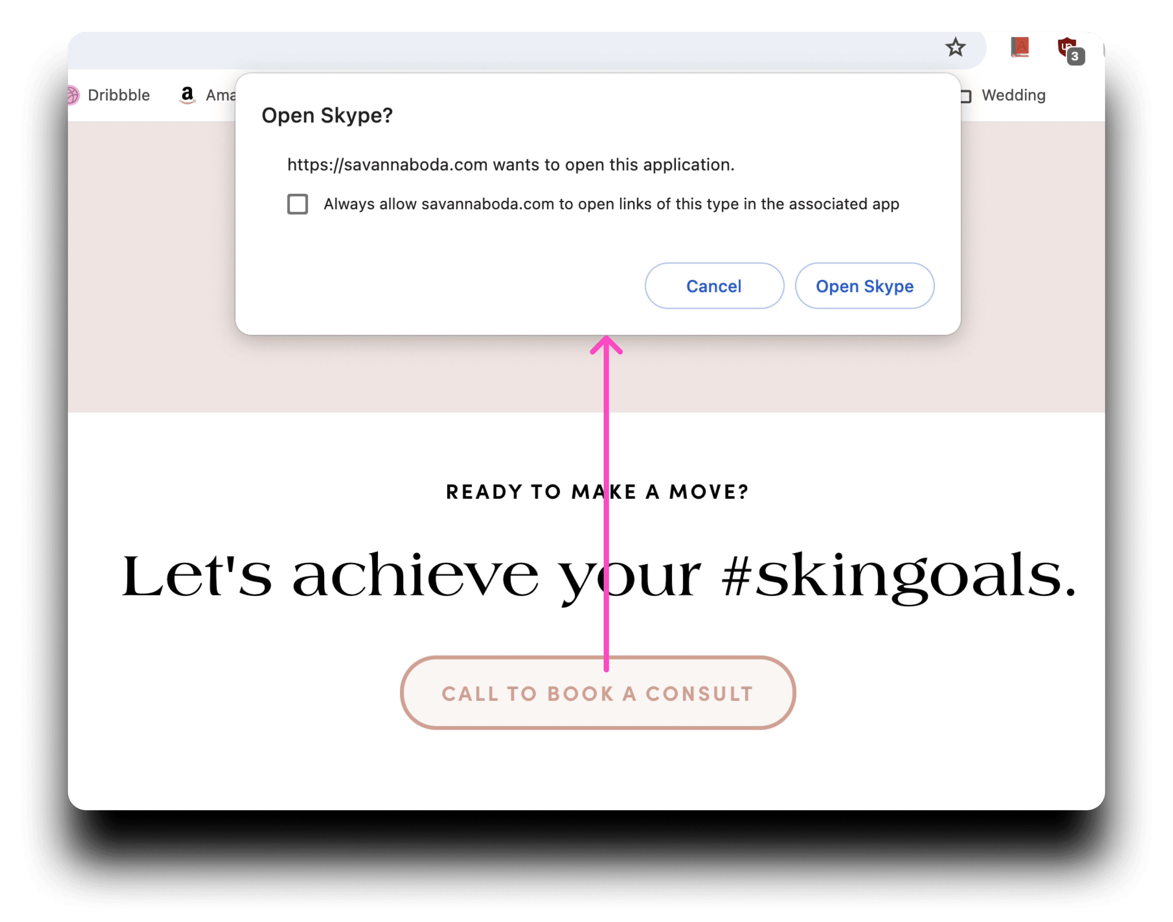


It also didn’t make it easy to book. It had to ask the user permission to open Skype, which disconnected the overall experience. I knew the flow could lose customers, who didn’t have Skype or were put off by a whole other application opening.
It also didn’t make it easy to book. It had to ask the user permission to open Skype, which disconnected the overall experience. I knew the flow could lose customers, who didn’t have Skype or were put off by a whole other application opening.
It also didn’t make it easy to book. It had to ask the user permission to open Skype, which disconnected the overall experience. I knew the flow could lose customers, who didn’t have Skype or were put off by a whole other application opening.
Planning
Planning
Planning
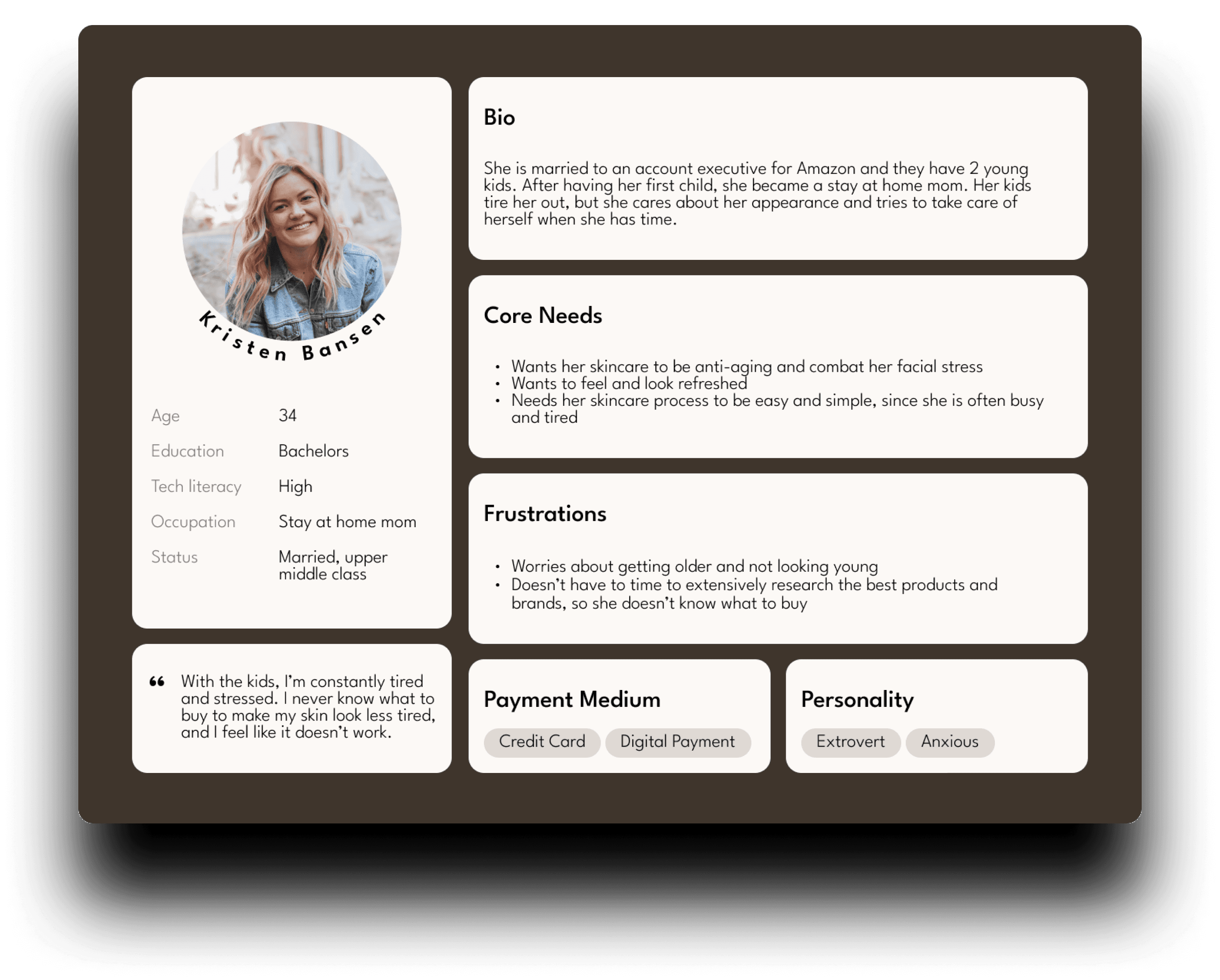
I asked the client what her average customer was like to figure out how I would market the branding. The age group would affect how causal the language and aesthetics would be, and since it was teenagers to middle-aged customers, I thought relatable and kind of informal content would be great.
I asked the client what her average customer was like to figure out how I would market the branding. The age group would affect how causal the language and aesthetics would be, and since it was teenagers to middle-aged customers, I thought relatable and kind of informal content would be great.
I asked the client what her average customer was like to figure out how I would market the branding. The age group would affect how causal the language and aesthetics would be, and since it was teenagers to middle-aged customers, I thought relatable and kind of informal content would be great.


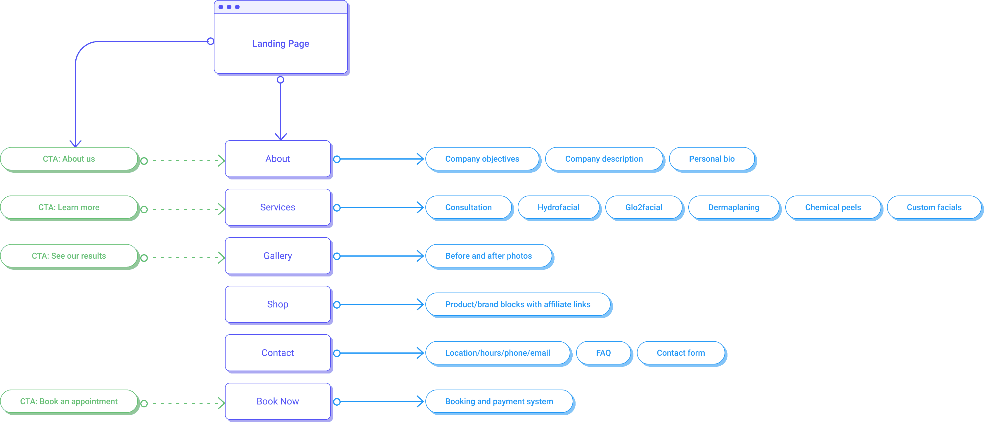
I feel like user flows are a great way to organize product structure and make sure nothing is forgotten, so I will typically fit it into a project. She based the site needs on competitor sites and her experience in the industry. As the project went on, we decided that the shop feature was unnecessary right now, especially since it felt like too much on Savanna’s website. This was an MVP with a deadline, so we cut it from the user flow.
I feel like user flows are a great way to organize product structure and make sure nothing is forgotten, so I will typically fit it into a project. She based the site needs on competitor sites and her experience in the industry. As the project went on, we decided that the shop feature was unnecessary right now, especially since it felt like too much on Savanna’s website. This was an MVP with a deadline, so we cut it from the user flow.
I feel like user flows are a great way to organize product structure and make sure nothing is forgotten, so I will typically fit it into a project. She based the site needs on competitor sites and her experience in the industry. As the project went on, we decided that the shop feature was unnecessary right now, especially since it felt like too much on Savanna’s website. This was an MVP with a deadline, so we cut it from the user flow.


Objectives
Objectives
Objectives
1
1
1
Create a high conversion funnel rate from brand discovery to appointment booking.
Create a high conversion funnel rate from brand discovery to appointment booking.
Create a high conversion funnel rate from brand discovery to appointment booking.
2
2
2
Provide an all-in-one center for customers: information, browsing, booking, and contact.
Provide an all-in-one center for customers: information, browsing, booking, and contact.
Provide an all-in-one center for customers: information, browsing, booking, and contact.
3
3
3
Develop a defined brand that presents a sense of professionalism, but also beauty and visual aesthetics.
Develop a defined brand that presents a sense of professionalism, but also beauty and visual aesthetics.
Develop a defined brand that presents a sense of professionalism, but also beauty and visual aesthetics.
Feedback
Feedback
Feedback
I always kept RSA's founder in the loop, regularly sending updates to create a final product she was happy with. One of our changes involved the photos used on various pages.
I always kept RSA's founder in the loop, regularly sending updates to create a final product she was happy with. One of our changes involved the photos used on various pages.
I always kept RSA's founder in the loop, regularly sending updates to create a final product she was happy with. One of our changes involved the photos used on various pages.
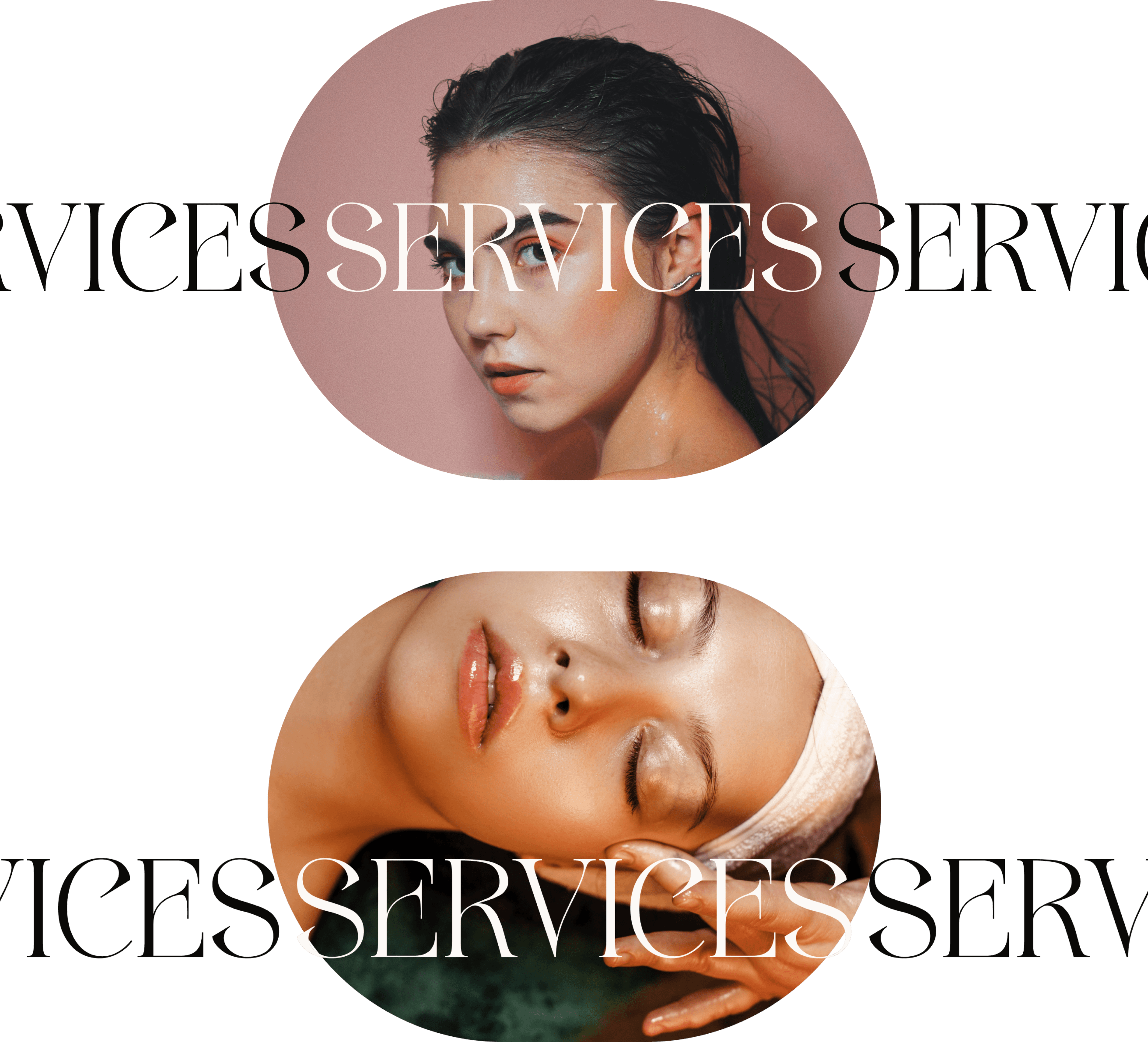


In my first stage designs, I used images that weren’t too saturated, didn’t attract too much attention, and visually focused on skin more than the women themselves in the photos. But she felt they didn’t 100% represent her desired branding, so I worked with her to select images that better spoke to her and the brand style.
In my first stage designs, I used images that weren’t too saturated, didn’t attract too much attention, and visually focused on skin more than the women themselves in the photos. But she felt they didn’t 100% represent her desired branding, so I worked with her to select images that better spoke to her and the brand style.
In my first stage designs, I used images that weren’t too saturated, didn’t attract too much attention, and visually focused on skin more than the women themselves in the photos. But she felt they didn’t 100% represent her desired branding, so I worked with her to select images that better spoke to her and the brand style.
As a minimalist and aesthetic brand, the images couldn’t be too loud, so we wanted to keep images simple and more obscure in a sense. Original: top, updated: bottom
Final design
Final design
Final design
Branding
Branding
Branding
Keeping with the neutrals, I used an analogous color scheme to support the sense of minimalism, with the off-white and pale beige being the primary colors to keep the brand style light and airy.
Keeping with the neutrals, I used an analogous color scheme to support the sense of minimalism, with the off-white and pale beige being the primary colors to keep the brand style light and airy.
Keeping with the neutrals, I used an analogous color scheme to support the sense of minimalism, with the off-white and pale beige being the primary colors to keep the brand style light and airy.
We landed on a bold header text; one that would be attention-grabbing and beautiful, paired with a graceful cursive text for secondary headers. Being bold in a delicate way helped the designs to exude beauty, while not being unprofessional with an unconventional font. I chose a very legible, clear sans serif body typeface to feel professional.
We landed on a bold header text; one that would be attention-grabbing and beautiful, paired with a graceful cursive text for secondary headers. Being bold in a delicate way helped the designs to exude beauty, while not being unprofessional with an unconventional font. I chose a very legible, clear sans serif body typeface to feel professional.
We landed on a bold header text; one that would be attention-grabbing and beautiful, paired with a graceful cursive text for secondary headers. Being bold in a delicate way helped the designs to exude beauty, while not being unprofessional with an unconventional font. I chose a very legible, clear sans serif body typeface to feel professional.



For the final logo, I created both monogram and wordmark logos, using them depending on the context, whether it was a small or large display area. I felt that this created flexibility and got to portray different sides of the brand.
For the final logo, I created both monogram and wordmark logos, using them depending on the context, whether it was a small or large display area. I felt that this created flexibility and got to portray different sides of the brand.
For the final logo, I created both monogram and wordmark logos, using them depending on the context, whether it was a small or large display area. I felt that this created flexibility and got to portray different sides of the brand.


Website
Website
Website
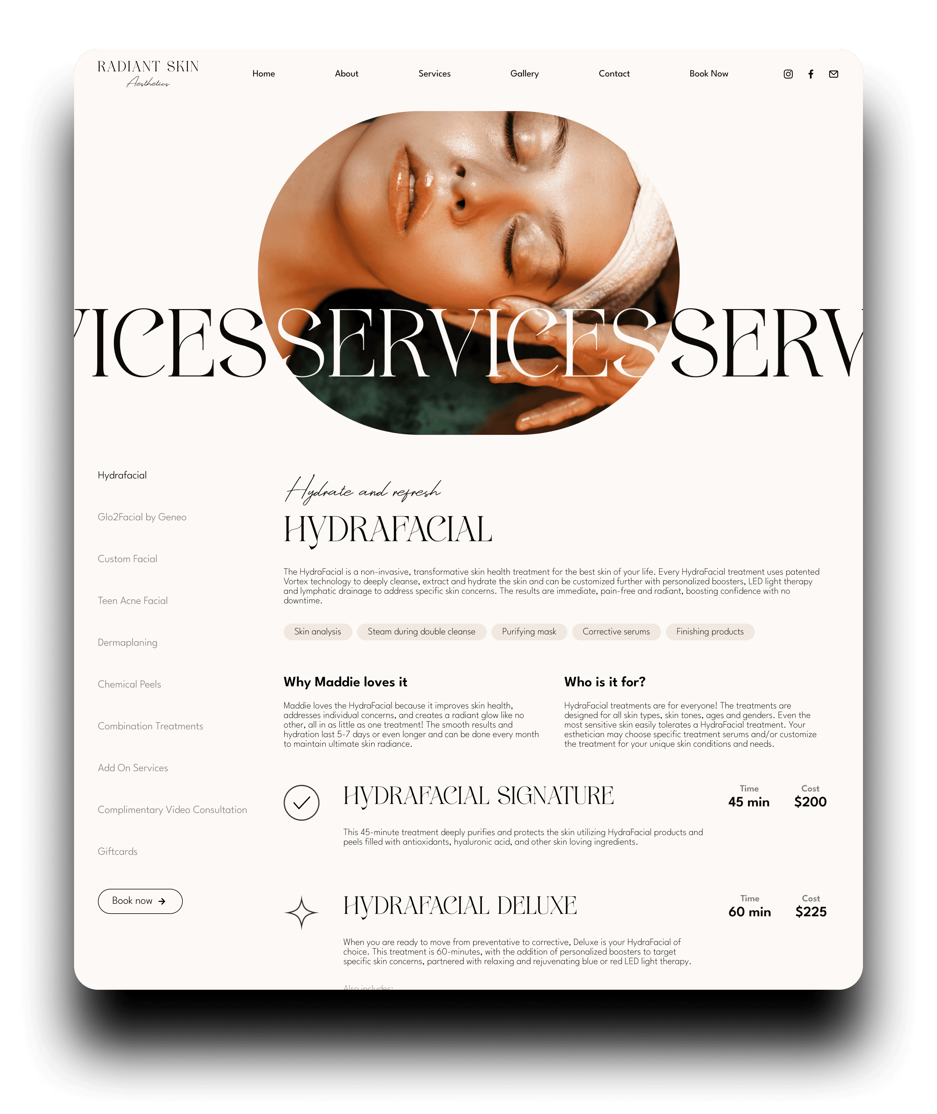
After all of our reviews, I presented the final design to the client before building it. I felt great about shipping these designs since she felt that they fit all of her brand and business needs. I used defined, easy to interpret sections and abundant white space to show an aura of professionalism.
After all of our reviews, I presented the final design to the client before building it. I felt great about shipping these designs since she felt that they fit all of her brand and business needs. I used defined, easy to interpret sections and abundant white space to show an aura of professionalism.
After all of our reviews, I presented the final design to the client before building it. I felt great about shipping these designs since she felt that they fit all of her brand and business needs. I used defined, easy to interpret sections and abundant white space to show an aura of professionalism.
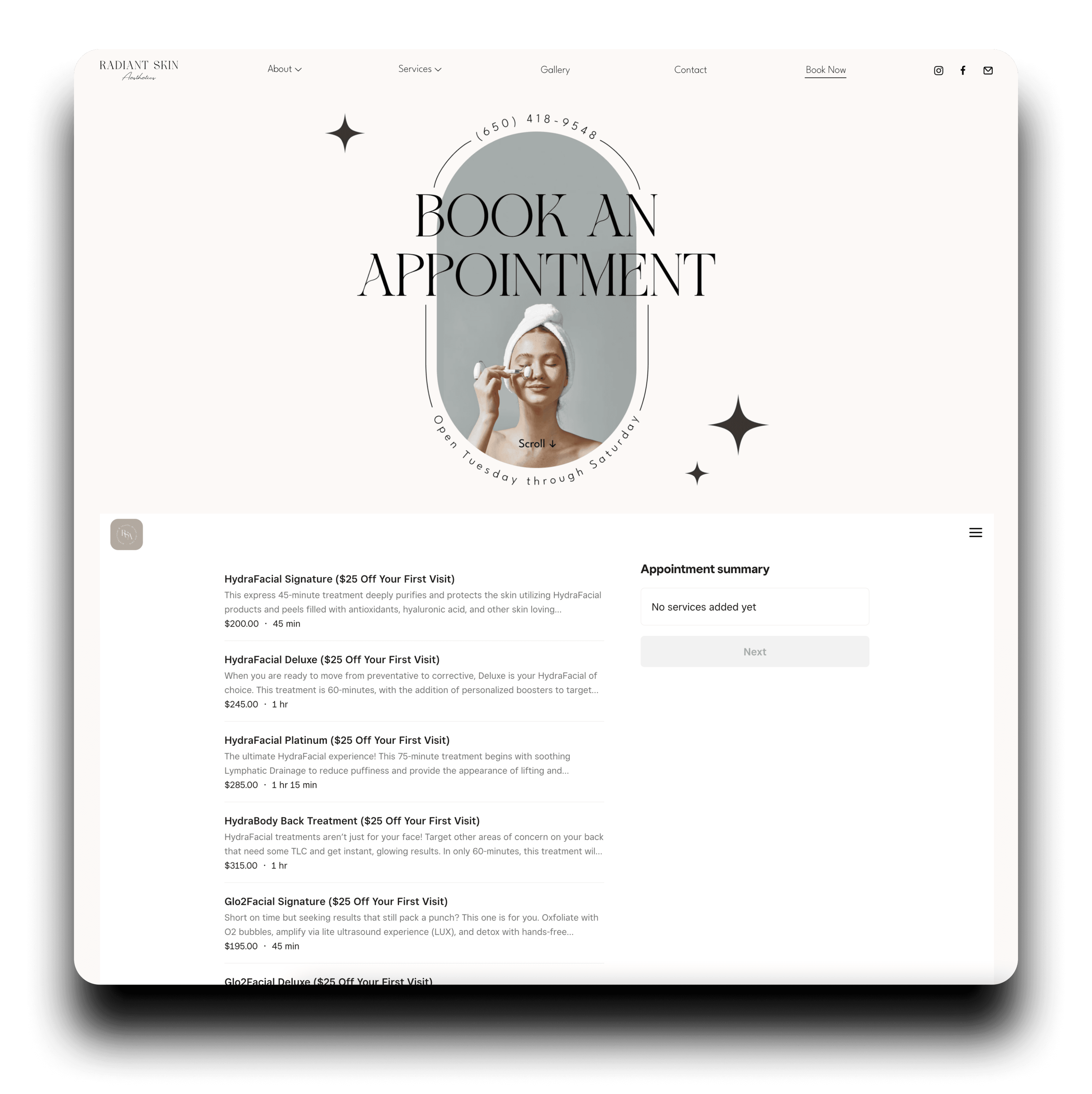
I loved using rounded images and circular text! I felt like it definitely added to the delicate vibe.
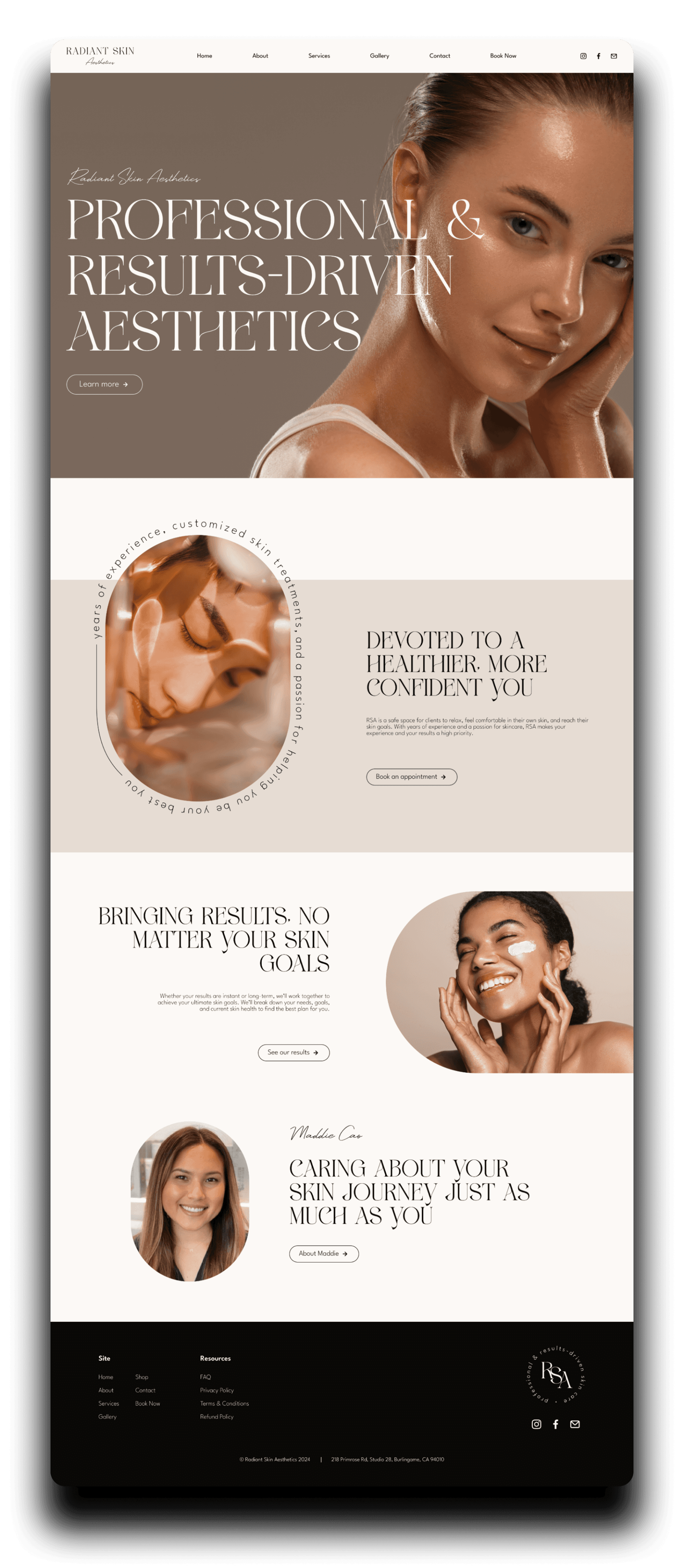


I made sure to make the site easy to navigate (especially the services page), not too information-dense, and incorporate enough buttons throughout the site to funnel users to the booking section.
I made sure to make the site easy to navigate (especially the services page), not too information-dense, and incorporate enough buttons throughout the site to funnel users to the booking section.
I made sure to make the site easy to navigate (especially the services page), not too information-dense, and incorporate enough buttons throughout the site to funnel users to the booking section.
I wanted to have a smooth booking system. Embedding a booking software into the site was important so that we could avoid some of those usability issues in Savanna Boda's site. We used square to create a more integrated experience.
I wanted to have a smooth booking system. Embedding a booking software into the site was important so that we could avoid some of those usability issues in Savanna Boda's site. We used square to create a more integrated experience.
I wanted to have a smooth booking system. Embedding a booking software into the site was important so that we could avoid some of those usability issues in Savanna Boda's site. We used square to create a more integrated experience.




I thought some subtle and cute illustrations really added a casual/trendy look. It seemed to be popular in similar sites, and it felt like a great fit for this style.
Launch
Launch
Launch
I launched the website on my own using Framer, including social and marketing assets, UI animations, and integrating booking with Square and contacting with FormSpark. It was a smooth launch and it turned out great for the user and business needs.
I launched the website on my own using Framer, including social and marketing assets, UI animations, and integrating booking with Square and contacting with FormSpark. It was a smooth launch and it turned out great for the user and business needs.
I launched the website on my own using Framer, including social and marketing assets, UI animations, and integrating booking with Square and contacting with FormSpark. It was a smooth launch and it turned out great for the user and business needs.
Closing thoughts
Closing thoughts
Closing thoughts
Within the first week, after sharing on social media, she booked 42% of her available appointments for the first month after opening— impressive for a brand-new business! That number grows every week, and I’m excited to see Radiant Skin Aesthetics keep growing too.
Within the first week, after sharing on social media, she booked 42% of her available appointments for the first month after opening— impressive for a brand-new business! That number grows every week, and I’m excited to see Radiant Skin Aesthetics keep growing too.
Within the first week, after sharing on social media, she booked 42% of her available appointments for the first month after opening— impressive for a brand-new business! That number grows every week, and I’m excited to see Radiant Skin Aesthetics keep growing too.
Getting to be creative and focus on UI/beauty was a really amazing part of this project. I loved working with RSA’s founder to help build her dream, and I look forward to seeing her continue to succeed.
Getting to be creative and focus on UI/beauty was a really amazing part of this project. I loved working with RSA’s founder to help build her dream, and I look forward to seeing her continue to succeed.
Getting to be creative and focus on UI/beauty was a really amazing part of this project. I loved working with RSA’s founder to help build her dream, and I look forward to seeing her continue to succeed.


